Paid advertising plays a vital role in e-commerce success. When it comes to getting eyes on your website’s landing pages, few marketing channels offer results as fast and at such a reasonable initial investment.
Sure, content marketing is super scalable, and direct email marketing may offer fantastic returns. But the thing is, these channels assume that you’re ready to play the long game.
Meanwhile, most e-commerce businesses are going to find themselves in a position where they want eyes on their site within hours of launching a new product. They may also want to make use of advertising platforms’ excellent targeting technology to ensure that they get the right kind of visitors to their landing pages.
No matter what kind of online business you’re running, it’s essential to run integrated marketing campaigns across various channels, maximizing the benefits each one offers. Paid advertising is affordable, its returns are virtually instantaneous, and it offers excellent targeting. There are obviously many more benefits, but we’ve hit the big ones here.
But what if we told you there’s another, little-used reward to paid advertising that few marketers are only now beginning to use appropriately?
While it may not have an immediate impact on conversions, using existing paid advertising campaigns to improve your landing pages offers an excellent alternative to traditional methods of conducting A/B testing.
The Importance of A/B Testing in E-Commerce
We’re not going to waste too much digital ink on this topic, but it still bears mentioning.
Advertising pioneer David Ogilvy was no longer around when testing started yielding results with an exceptional level of detail. But that doesn’t make his famous quote from 1962 about its importance any less relevant:

If Ogilvy had had access to the tools that monitor user interaction, generating bounce and click-through rate metrics along the way, he’d have been an even bigger advocate for it.
Nowadays, marketers can harvest virtually endless streams of customer-interaction data via dozens of integrated channels. If we’re not using each of these to their full potential to spot opportunities for improvement, we’re severely damaging business growth.
It’s important to note that in this article, we’re not referring to testing advertisements themselves. Instead, we’re taking a broad look at how paid advertising campaigns can improve customers’ experience on your landing pages.
Optimized e-commerce UX is one of the major factors in conversion. And no designer, content writer or marketing expert is going to get it right the first time. Optimization takes time, effort and willingness to listen to what your customers are telling you.
This brings us to the question of what should be tested. What are the typical UX elements on an e-commerce site’s landing page that contribute to conversion? While there are no absolute answers here, industry experts will agree that the following components of a landing page are worth testing:
- Page headline
- Hero images
- Product image and placement
- Call-to-action (CTA) text, color and placement
- Product descriptions
- Discount or special offer phrasing, design, and placement
More exhaustive lists on e-commerce A/B testing have been created, along with some excellent justifications and methods of how to test these elements. Do some research on this topic – it’s well worth your time.
Dive Deeper:
* What Is A/B SEO Testing?
* The 4 Fundamentals of E-commerce Website Design
* How to Create an E-commerce Website Step by Step
* How to Set Up Your E-commerce Product Page for Maximum Conversions
Method One: An Inexpensive, Effective Testing Channel
In this section, we’ll talk about the first method of leveraging paid advertisements to improve an e-commerce site’s UX. This involves running two concurrent paid advertisements, each linked to two instances of the same landing page. The only difference between the two landing pages is the element that’s being tested.
1) Solving Two of the Biggest A/B Testing Challenges
There are numerous challenges facing a marketer who wants to conduct an A/B test on a particular e-commerce landing page. And using paid advertising as the channel to obtain test subjects solves two of the biggest ones.
a) Reaching a Significant Sample Size
Any test that’s dependent on subject input needs a large enough sample size to be statistically relevant. This is not only best practice for A/B testing – it’s also just solid science.
If a marketer wants to weigh the potential customers’ response to a new style of product imagery, there’s a point where the data gathered becomes valuable. Depending on the industry, niche and product itself, this point might be found closer or further along in the process. This will be something that the person conducting the test will have to define prior to running it.
Channeling subjects from an email newsletter is an option, but it largely depends on the size of the subscriber-base, as well as their appetite for conducting a test without any incentive. Running a real-world focus group is also an option – but to reach that level of statistical feasibility would mean that tests could take weeks, given how high-touch they would be.
The answer?
Create an A/B test trigger that’s going to reach a very large audience pool, without the subjects knowing that their response is being analyzed.
Run two concurrent, identical Google or Facebook advertisements, each pointing the visitor to a different instance of the landing page being tested. The primary goal of the advertisement is still to convert visitors to customers; this isn’t compromised. However, the slight UX variation on each of the two pages is very likely to result in varying engagement metrics.
When using paid advertisements for this purpose, reaching a satisfying sample size is dependent on how much the marketer is willing to spend on the advert. Their number of email subscribers or the time they have available to conduct in-person testing is no longer an issue.
b) Turnaround Time
In the above example, data on landing page engagement can be measured instantly once the advertisements go live.
Using paid advertisements to obtain test subjects means minutes, as opposed to days or weeks, before people even become aware of the test.
And if effective keyword bidding methods are used, there’s no reason why landing page B (the one with the red CTA, for instance) couldn’t emerge as the clear winner within two days of launching the campaign. Try to emulate this turnaround time with a newsletter, blog post or in-person test session.
By leveraging paid advertisements to gather engagement data on two landing pages that are identical in every way but one small detail (like the CTA button color), marketers are shortening the length of time that their users are interacting with an unoptimized design.
This has a direct effect on the company’s bottom line, making this approach to A/B testing an even more attractive proposition.
2) Limit the Test Variables
The knowledge harvested from these tests is only accurate when the number of variables involved is kept to an absolute minimum. To that end, it’s critical that the content of the advertisements linking to the two landing page instances is exactly the same.
When engaging with an advertisement, certain expectations are created with the potential customer. This is referred to as “ad scent”:
Ad scent is essentially the consistent informational relationship between the advertisement and its landing page.
Paid advertising best practices suggest that the expectations created with the advertisement must be consistent with the information presented on the landing page itself.
If the advert creates particular expectations through its content, the marketer will want to recreate these expectations for both versions of the landing page. Otherwise, test results could be compromised. Users may interact differently with the landing page purely because different expectations were created in the test “trigger.”
To keep it simple: If you’re using this method to conduct A/B testing, make sure you’re using the exact same advert.
The second space where we need to avoid skewing research data is if there are too many variations between the two landing page versions. Ideally, testers will want only one visible UX variation between the two pages. This way, any variation in user engagement can be mapped to only the element being tested.
Essentially, it takes the guesswork out of the analysis process. For instance: Landing page A resulted in a 12% higher conversion rate than landing page B because of a known variable – like the CTA button color or the page headline.
Dive Deeper:
* 5 Important Landing Page Elements You Should Be A/B Testing
* How to Run A/B Tests that Actually Increase Conversions
* Ecommerce Advertising Strategy: How We Doubled PPC Sales for ThinSlim Foods (with a 3X+ ROAS)
Examples
1) Gili Sports Paddle Boards

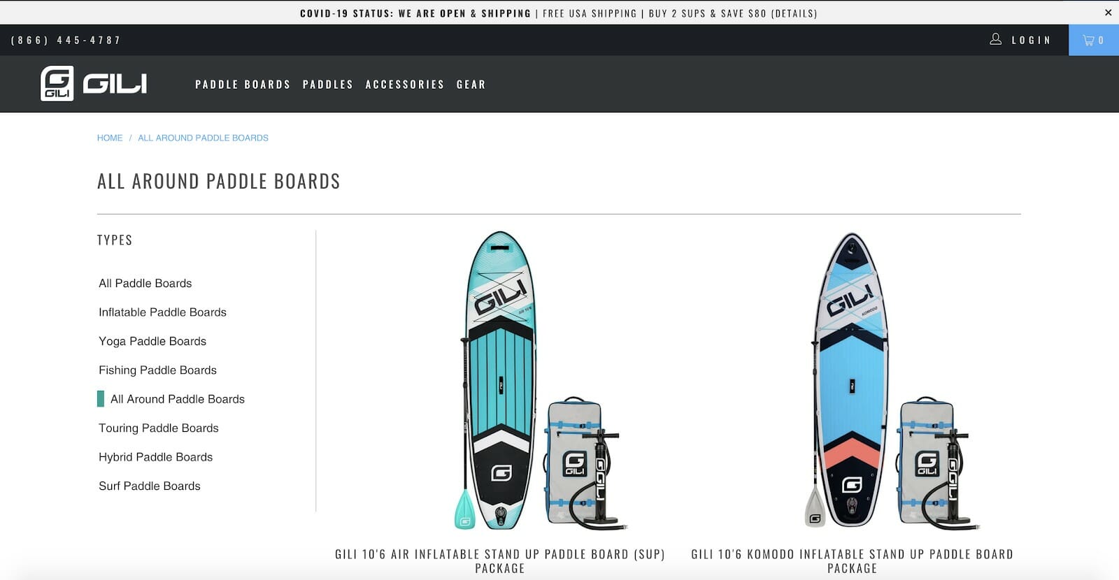
The product category landing page for this paddle board manufacturer shows a number of UX elements that are ripe for testing using the method we described above:
- By placing identical Google ads that correspond with a keyword like “Best All Around Paddle Boards,” the designer can link to two different instances of this page, with a particular UX element variation.
- In this case, the absence of an “Order Now” CTA placed alongside each item in the product category page could be tested against a version where a user can instantly place an order without having to click through to the product page itself.
- The number of products that end up in a user’s shopping cart from one version of the page can be compared to the other. And, as we said before, this information can be obtained in a relatively short period.
- Alternatively, the site designers could also experiment with a second page where the product images are smaller, but a larger selection is visible without the user needing to scroll down the page. For this test, valuable information on the click-through rate to the product page can be mined from Google Analytics.
2) Birchbury “Bramfords” Shoes
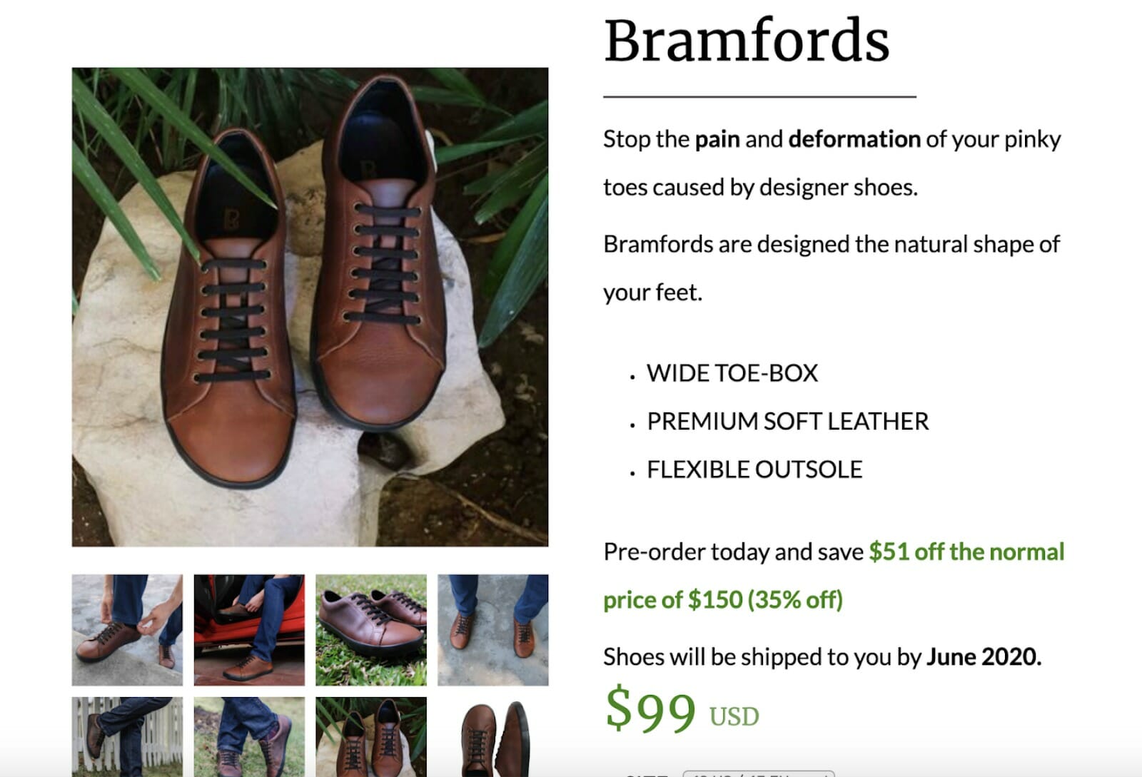
The first version of the Birchbury Home Page – which was also the main “ordering” page for their flagship shoe – had relatively disappointing results from a conversion perspective. This version of the landing page only made reference to the price discount in the product description’s text:
 The site owners used a second, identical advertisement to lead users to an alternative version of the page, where the discount was given further visibility below the product description text.
In this version, the previous price is clearly struck-through and the new price is shown in a different color. This extra spotlight on what the customer will be saving turned out to be an incredibly effective UX element and saw an increase in conversion from 1% to 1.85%:
 The speed and ease with which this information was harvested meant that the alternative version of the landing page could quickly be adopted as the new default page.
Birchbury was able to expose a conversion-optimized page to their visitors much earlier than if they had used an alternative method of triggering an A/B test. And, once again, piggybacking this test onto a process that was already “in action” meant that they had to do very little legwork to obtain this valuable information.
Method Two: An Alternative to Landing Page Testing
While this may seem a bit like the tail wagging the dog, using multiple versions of advertisements is also a very feasible way to drive the design of a landing page.
This method differs dramatically from the previous one, and it’s best implemented on a platform like Facebook or Instagram, where ad copy is combined with other visual elements like photographs or video. Here, marketers will create two or more versions of the same advertisement, each with a slight difference in design. The product image, the customer testimonial or even the main CTA text may be different across the various ads.
By simply monitoring each advert’s click-through rate, marketers will build a wealth of information on how the first version of the landing page should look. Where there is a clear winner in terms of click-throughs, it’s obvious that a particular combination of visual elements resonates with the target audience.
Once a feasible sample size is reached, site designers can take the lead from the design of the winning advertisement to fine-tune the design of their landing page.
Dive Deeper:
* 7 Easy Ways to Optimize Your Facebook Ads
* 8 Facebook Ad Copywriting Tricks to Maximize Conversions
* The Power of Social Shopping on Instagram (and How to Sell More in 2023)
Example
1) Zoma Mattresses
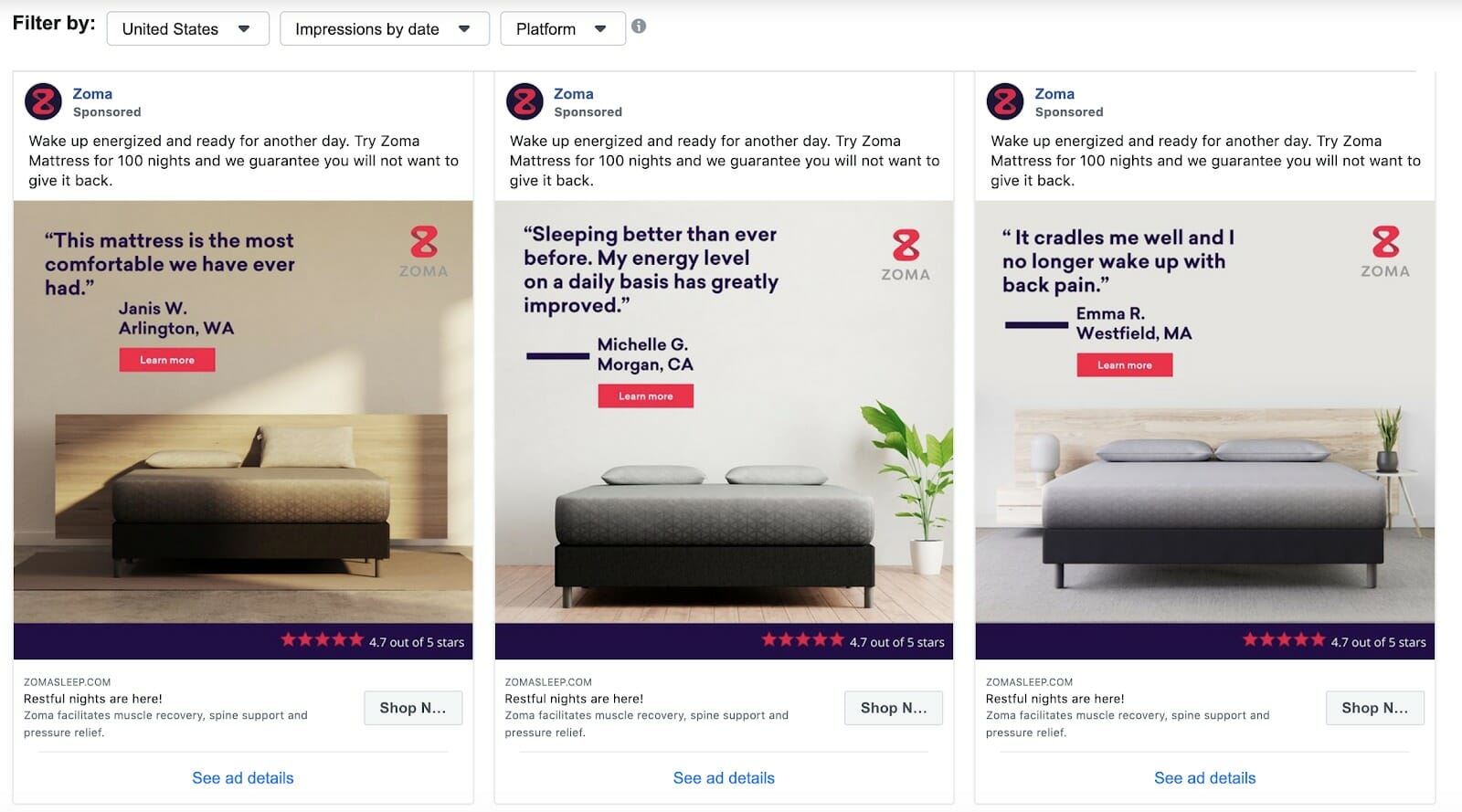
Zoma’s selection of advertisements, all linking to the same product landing page, is an excellent example of how ad performance can shape UX design. The selection of Facebook advertisements below shows the range of designs that the company’s marketing team used:

As you can see from the three adverts, the designers opted to limit the variables between the ads to only the product image and the customer testimonial. Even though other elements like the CTA, ad headline and product description could also have been changed, this would have cluttered the engagement data and made spotting the reason for the winning advert a tough task.
What Zoma might have discovered after a reasonable sample size was reached was that a product image that didn’t distract from the mattress itself resulted in the highest click-through rate. Armed with this knowledge, site designers can create as much alignment between the design of the winning advert and the landing page design.
Last Word on Using Paid Ads Data for E-Commerce UX
Committing to constantly improving landing pages is something that e-commerce companies should embrace with open arms. Those that aren’t already aware of the benefits, or are simply too busy with other strategies, are very likely to be running at a lower ROI than their competitors.
There’s a wealth of technology and methods available to excel at this important process. All it takes is for business owners to grasp the concept and make use of marketing channels they’re already likely to have in place.
The overhead necessary for mining this information is more than reasonable. No new marketing or communication channels need to be created. Existing ones simply need to be smartly appropriated.


