Your website is like a playbook for your brand. It’s used for inviting people in to discover what value you can offer them. To that end, every single detail about it is vitally important — and that includes your brand colors.
In this blog post, we’ll dive into the topic of brand color and its impact on user engagement and conversions. You might be surprised to learn how a simple color choice can make a significant difference in your online success.
Without further ado, let’s get to it.
Why Brand Color Matters for Conversions
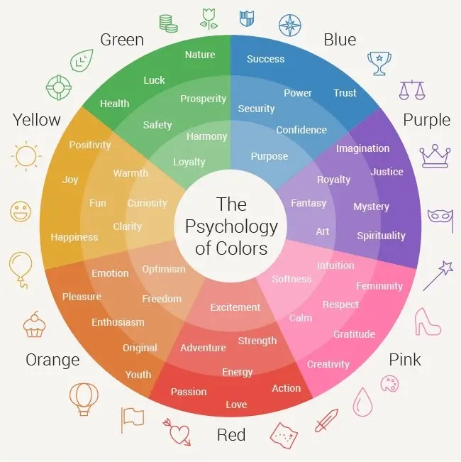
When visitors arrive on your website, the first thing they notice is its visual appearance. Colors evoke emotions, convey messages, and create a sense of brand identity:

By strategically selecting brand colors, you can effectively communicate your brand’s personality and values to your target audience.
Moreover, brand colors can influence user behavior and guide visitors toward specific actions.
When used correctly, they can enhance the visibility of important elements such as call-to-action buttons, forms, and links. By making these elements stand out, you increase the likelihood of user engagement and conversions.
Consistency in brand colors across different touch points also plays a vital role in reinforcing brand recognition and building trust. When visitors encounter your brand colors consistently throughout their interactions with your website, social media profiles, and marketing materials, it creates a cohesive and memorable brand experience.
To optimize your website for conversions, it’s essential to choose brand colors that align with your brand’s values, target audience, and industry. Conducting thorough research, analyzing competitor colors, and considering color psychology can all inform your decision-making process.
Dive Deeper: The Complete Guide to Brand Building (Must-Read for Digital Marketers)
The Power of Orange
The color orange has been a topic of discussion for us recently. While some might argue that orange is one of the least engaging or inspiring colors, our experience tells a different story.
Let’s explore why we use the color orange on two websites.
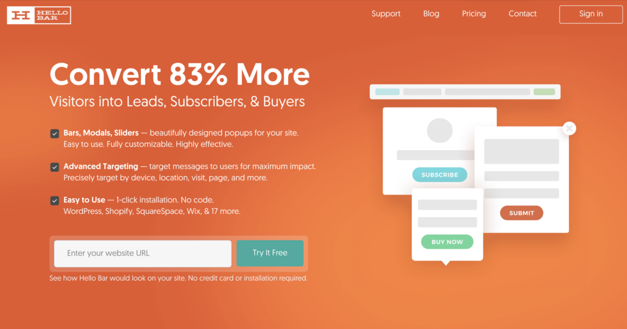
Hello Bar is a company that Neil Patel used to own and generates top navigation bars and headers for websites. During the conversion testing, he discovered that the Hello Bar site, which was predominantly orange, converted notably well. This finding prompted them to run numerous A/B tests, and the results consistently showed that the orange color performed exceptionally in driving conversions.

Single Grain is a full-service digital marketing agency (e-commerce, PPC, SEO, CRO, etc.) owned by Eric Siu, known for driving and converting quality traffic so that clients continuously hit or surpass their revenue goals.
We did a rebrand a few years ago, and we also decided to pick a new color for it. And we did the research and found that orange was one of the most engaging colors. Orange tends to stand out because not many sites are orange and it fits in well with the palette that we have.

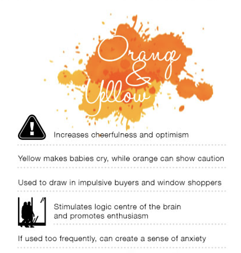
However, it’s important to note that excessive use of orange can be detrimental to conversions. We found that maintaining a white background with bright call-to-action buttons and strategically using orange accents improved click-through rates and boosted conversions. It required us to strike a balance between the density of orange mixed with white space on the site to get the most mileage out of the branding color.
Dive Deeper: How to Run A/B Tests that Actually Increase Conversions
Selecting Brand Colors and Brand Identity
When people visit your website, one of the first things they can mentally and visually process is the colors on your site. One of the first impressions they’ll quietly form about your brand is the attractiveness of your brand’s appearance, which includes imagery, fonts, and especially the colors.
There are plenty of different reactions and feelings commonly associated with various colors in digital marketing. For the purposes of this post, we’re highlighting the efficacy of the color orange and the feeling that is drawn out by people who see it.
Orange is a color that marries the calm tranquility of yellow with the aggressive determination of red, creating a medley of feelings that drive viewers to feel comfortable while at the same time confident.
Choosing the right brand colors goes beyond personal preference or arbitrary selection. When we embarked on a rebranding journey, we conducted thorough research to identify the most engaging colors. Orange emerged as a standout choice due to its calm yet assertive nature.
While conversion studies are not always necessary, understanding the psychology behind colors can guide your decision-making process. Colors have the potential to evoke specific emotions and influence user behavior. However, it’s important to prioritize testing to find what works best for your website and target audience.
Dive Deeper: 10 Psychological Hacks to Improve Your Content Marketing
Stand Out and Pop
One of the key factors in leveraging brand colors for conversions is ensuring that your call-to-action buttons stand out. This principle applies regardless of the chosen color. Whether it’s orange, red, or any other hue, the key is to make it visually distinct and easily recognizable as a clickable element.
Neil was on a call with a company that wanted to get more software sign-ups. After looking at their website, he said, “Have you tried testing your CTA?” They said they’d tested the text, but not the color because it was within their brand color scheme. So he pointed out that the color they were using blended in with the rest of their website, so much so that it took him a while to find the CTA button.
This happens a lot more than you would think, but the fix is super simple.
Make sure that your CTA button stands out. Solve the design problem and you’ll get more clicks and conversions.
Regardless of the specific brand color you choose, the key is to make your CTAs visually distinct and easily recognizable as clickable elements. This principle applies not only to the color of the buttons but also to their design and placement.
To create CTAs that stand out and pop, consider the following strategies:
- Color Contrast: Choose a brand color for your CTA buttons that contrasts well with the surrounding elements. This contrast helps draw attention to the buttons and makes them more noticeable. For example, if your website has a predominantly white background, a vibrant color like orange or red can create a striking contrast.
- Size and Shape: Opt for a button size and shape that is visually appealing and differentiates it from other elements on the page. A larger and more prominent button is more likely to catch the eye and prompt action. Experiment with different shapes, such as rounded corners or unique button designs, to make them visually distinctive.
- White Space: Surround your CTA buttons with ample white space to make them visually prominent. White space provides breathing room and helps direct the user’s attention to the button. Avoid cluttering the area around your CTAs with other elements that might distract or overshadow them. At the end of the day, white spaces are meant to diffuse the potency of your chosen brand color from being too overwhelming.
- Button Text: Use succinct language on your CTA buttons to clearly communicate the action you want users to take. The text should be legible, contrasting with the button color for optimal readability. Experiment with different wording and copy to find the most effective messaging for your target audience.
Remember, while it’s important for your CTAs to stand out, avoid using neon bright colors or overwhelming designs that might strain users’ eyes or create a negative user experience. The goal is to strike a balance between visual appeal and usability.
Dive Deeper: How to Create Better-Converting In-Content Calls to Action (CTAs)
Testing and Refining Your Brand Colors
While research and color psychology can provide valuable insights, the true effectiveness of your brand colors can only be determined through testing.
Conducting A/B tests allows you to experiment with different color variations and gather data on user behavior and conversion rates. This empirical approach helps you make data-driven decisions and refine your brand colors for optimal results.
Here’s how you can effectively test and refine your brand colors:
- Set Clear Objectives: Before you start testing, define specific objectives for your tests. For example, you may want to increase click-through rates on your call-to-action buttons, improve overall engagement, or boost conversion rates. Having clear objectives helps you measure the success of different color variations accurately.
- Choose Testing Variables: Select the variables you want to test, such as button colors, background colors, or even the color of your logo. By focusing on one variable at a time, you can isolate its impact and gather precise insights. Avoid testing multiple variables simultaneously, as it can be challenging to determine the exact cause of any observed changes.
- Implement A/B Tests: Create two versions of your web page or design — one with the original brand colors (control) and another with the variation you want to test (variation). Use A/B testing tools to randomly divide your website visitors into two groups, ensuring that each group sees only one version. Track user interactions, click-through rates, conversions, and other relevant metrics to compare the performance of the control and variation.
- Analyze Results: Once you’ve collected sufficient data, analyze the results of your A/B tests. Determine which variation performed better in terms of your predefined objectives. Look for statistically significant differences in metrics like click-through rates, conversion rates, or engagement. Data analysis tools and statistical significance calculators can help you interpret the results accurately.
- Iterate and Optimize: Based on the results of your A/B tests, iterate and refine your brand colors accordingly. Implement the winning variation or make further modifications to continue improving performance. Repeat the testing process whenever you make significant changes to your website or brand identity.
Remember, A/B testing is an ongoing process. Consumer preferences, trends, and market dynamics can evolve over time, so regularly revisit and test your brand colors to stay aligned with your target audience’s expectations and preferences.
Dive Deeper: 16 Branding Trends to Increase Awareness
The Importance of Consistency
Consistency is crucial when it comes to brand colors. It’s not enough to select the right colors; you must also ensure their consistent implementation throughout your website. By maintaining a cohesive brand color palette, you establish a strong visual identity that resonates with your audience.
Inconsistencies in brand colors can confuse visitors and dilute your brand message. Make sure to define brand color guidelines that outline the specific shades, combinations, and usage rules. Consistency across various elements like logos, backgrounds, buttons, and text helps reinforce brand recognition and instill trust in your audience.
Last Words on Harnessing the Power of Your Brand Color
Your brand color is not merely a matter of aesthetics but rather a strategic component in driving conversions and building a strong brand identity.
Remember that the right brand colors are unique to each website and audience. What works for us may not work for your brand, and vice versa. The only true way of knowing that is to test various colors with your brand and gauge how your audience behaves.
If you tap into the mindset of your audience, apply it to color psychology and run the right A/B tests, you will inevitably find the perfect balance that captivates your audience and drives them to take meaningful action on your website.
If you’re ready to grow your business, Single Grain’s marketing & growth experts can help!👇
Repurposed from our Marketing School podcast.


