We live in a world of instant gratification.
Mobile devices have obliterated the need to wait for a breaking news report or wait until stores open up to do some shopping. The proliferation of fast food joints has made regular restaurant wait times seem painfully long. And of course there’s that specific text lingo, indicative of a new generation who refuse to spend 10 seconds longer penning a coherent sentence.
Yet while this phenomenon has found a foothold in our day-to-day lives, the need for immediate results is most apparent in modern business practices.
The ability to roll out digital stores and online sites in a matter of hours has led to a belief that even the most time-starved entrepreneur or business can increase their revenue overnight. Increasing revenue overnight is a rarity, a battle more often lost than won, which is not to say there aren’t a few immediate fixes you can implement.
13 Ways to Increase Conversion Rates
1. Edit for Clarity
This is the most important point in this list.
Clear, coherent writing is a fundamental step for effective communication.
Thanks to user attention spans now resting at just over 8 seconds and the online habit of scanning content, getting your primary message across in as few words as possible is a necessity.

You need to ensure that your content not only concisely explains your key selling benefit, but that your content is formatted in such a way that makes finding those points easy.
This isn’t the article to go into detail on this subject, but as a general rule you should:
- Cut everything that’s not 100% conducive to your message
- Make use of whitespace, bullet points, and proper headings/sub headings for easier scanning
If you do this, your content will be much easier to read (i.e. pleasant), which should, in turn, increase your conversion rates.
2. Solve Your Prospect’s Problems
Sure, exercising brevity and cutting excess words leads to quicker communication. But the speed with which you communicate only matters if you’ve focused on the selling points that are most important to your prospects.
Even the most beautifully optimized and scannable content will fail to impress if it doesn’t answer any key questions or solve any problems.
The million dollar question is: how can you identify your audience’s primary pain points and concerns?
The simple answer is to ask your customers directly. There’s plenty of survey services available which will let you send extensive questionnaires to your primary audience.
If that’s not your style or you don’t yet have an audience to survey, dig into a little review mining. Joanna Wiebe of Copyhackers has a great guide on how she managed to increase the conversion rate of a single landing page by over 400% just by pinpointing user problems.
Even the most succinct copy will fall flat if it’s not answering a need or solving a problem. Find the overlap between need and what you offer and you’re halfway to seeing your increase.
3. Run QA Tests
We operate in a world that has a love affair with the term A/B test.
It’s a term bandied around as if it were the sole method of increasing conversions. All you need is a control and a variable and you can see some decent increases, right?
Wrong.
The majority of marketers out there understand the concept behind A/B testing, but few truly understand the best practices required for an effective A/B test.
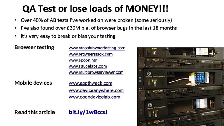
Too many tests are run with errors or mistakes that completely undermine the validity of the results. In fact, according to Craig Sullivan, 40% of A/B tests suffer from quality issues.

Let’s say you run a test on your button colors and discover that your variant outperforms your control. The logical next step would be to implement your variant as the new control.
Unfortunately, your test also suffered from a java script error which failed to load the control button on Chrome. Your whole test has pitted a working variant against a broken control, so the results are completely invalid.
If you had taken the time to QA test both control and variable across all browsers you’d have identified the problem and could have confidence in your test.
Before you implement any A/B tests, make sure that everything is working as it should be.
4. K.I.S.S. (Keep It Simple, Stupid!)
We’ve already discussed the modern user’s painfully short attention span.
That attention span, or lack thereof, means that no one is going to spend five minutes searching for the one page, product or link they’re after.
Everything on your page should be as simple as humanly possible. Ask yourself if there’s anything you can do to remove unnecessary links, copy or design elements from the following:
- Navigation bar
- Site design
- Copy
- CTAs
Reduce everything down to the bare minimum. The less there is on page to distract and confuse, the more time your users will have to examine your amazing USP.

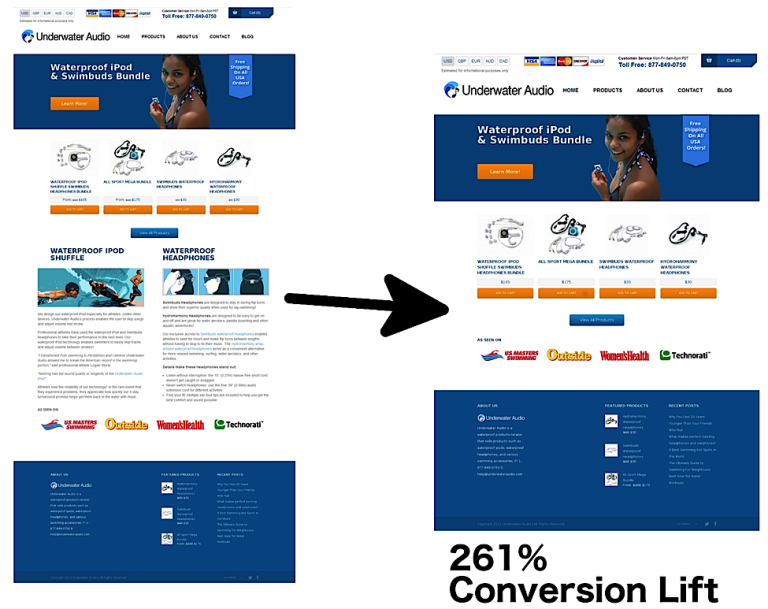
There’s plenty of case studies out there which prove how simpler pages convert at a higher rate. In this above example published on Crazy Egg, the simpler variant brought a lift of 261%.
5. Data Is All that Matters
You’ve read a few CRO case studies and know what you’re talking about, right? You’ve got your opinions and you know exactly what it takes to increase the conversion rate of a page.
But you probably don’t.
That arrogant belief has sunk more businesses than I care to mention. You might know the intricate details of a good CRO campaign and have the most in-depth knowledge of your product, but if you’re looking to increase your conversion rates, then you don’t know the mind of your audience.
Stop basing your changes on your own opinion of what you think will work. If you’re optimizing or implementing a new strategy, the only guiding light to follow should be that of your results. Data is all that matters.
If the results conflict with your personal beliefs and opinions, then that may be a bitter pill to swallow, but one you’re going to have to.
6. Copy the Test, Not the Methodology
The Internet is full of awesome, free, and useful advice. But you shouldn’t take it at face value.
Sounds kind of hypocritical, I know. I am, after all, the one writing some of that free content for you to read.
However, I’m not about to launch into a tirade against the content producers out there and slam the advice they give. The problem I have with free advice is how a lot of wannabe CROs and online marketers interpret it.
They read how company Y changed their button colors to orange and saw a 400% increase in conversions and think “Wow! I need to use orange buttons!”
But those orange buttons rarely increase the reader’s conversion rate. Why? Because they’ve copied the methodology, not the test.
Each test result is unique. Audiences are different so they have varying expectations and needs. To think that one change will bring favorable results across all industries and audiences is ridiculous.
Instead of copying the methodology, you need to copy the test if you want to see similar results.
In the aforementioned example, orange buttons converting at a higher rate is the result. The test would have been to try out different button colors.
7. Small Tweaks Rarely Bring Big Changes
Everyone loves to read how a minor change brought astounding results. It’s something we all wish we could achieve.
And sure, it is possible. There are plenty of case studies out there which highlight how minor changes have managed to bring some pretty astounding results. But they are the minority.
You’ve got to be realistic about your CRO campaign. Small changes might bring a decent uplift, but typically the best results come from large overhauls and redesigns, not single word changes or switching colors.
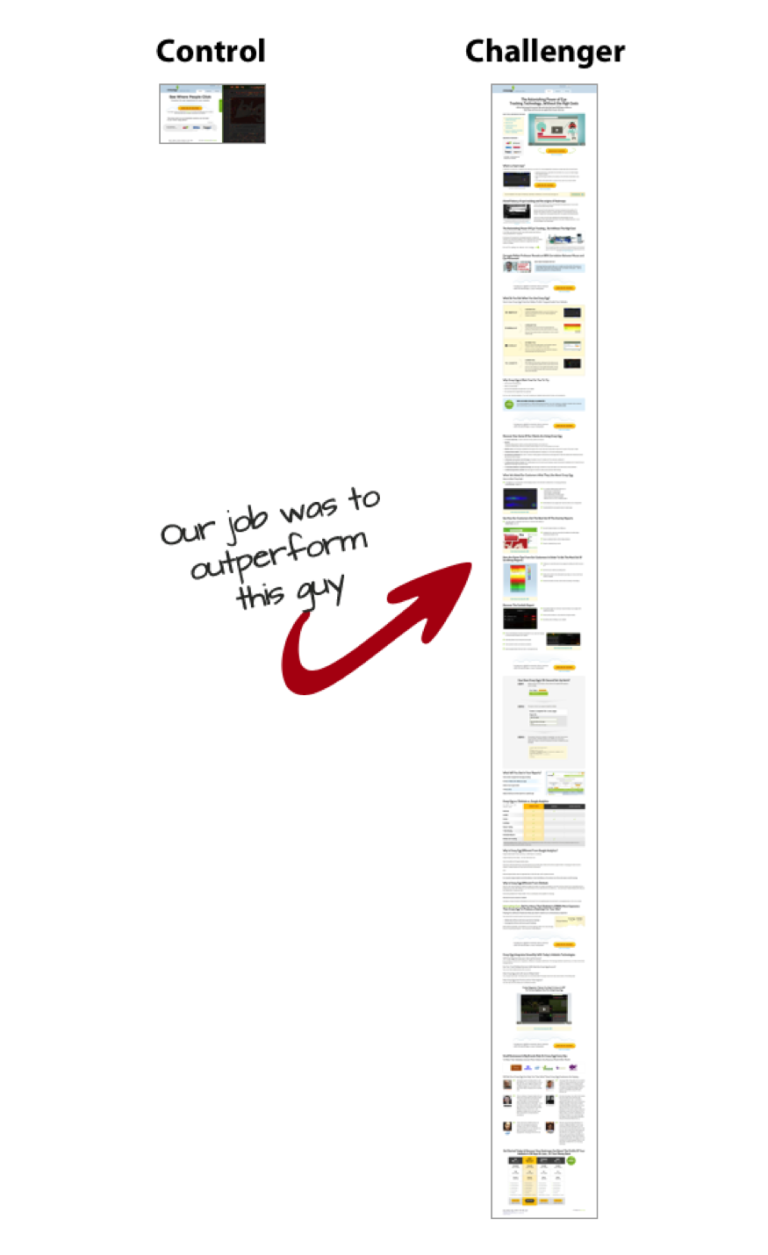
If you delve into the web’s archives of best CRO case studies, you’ll find that the huge conversion lifts come from huge changes. The Conversion Rate Experts case study on increasing Crazy Egg’s conversion rate is a prime example of exactly that.
CRE carried out an A/B split-test and discovered that their new page (“Challenger”) performed 30% better! After hearing about short attention spans for so long, it might be hard to believe that the 20-percent-longer home page did better, but as the experts at CRE said, “In reality, you cannot have a page that’s too long — only one that’s too boring.”

Read More: How We Instantly Raised Average Order Value by 10%—A Case Study
8. One Purpose Per Page
There’s a lot of landing and product pages out there that try too hard to do too many things. I imagine the CRO in charge looks at the page and says, “Hmm, well, we want people to buy this product from this page, but let’s also give them the option to sign up for the newsletter and check out related products.”
No. Just no.
One page, one purpose. That’s my golden rule of CRO.
If you’ve created a page that’s aimed at selling a product, then the user should only have two possible actions to take:
- Yes, I want to purchase this (and clicks the purchase button)
- No, I don’t want to purchase this (and leaves the page)
That’s it.
Plenty of studies, most famously the Jam Study, have proven that an increase in choices is actually demotivating to the person trying to make a decision. Ensuring that each page only has one purpose helps:
- Reduce confusion for the user. They know exactly what it is they have to do and will weigh it up with a yes or no response rather than a “Do I purchase, sign up or subscribe?” response.
- Tailor your copy because you can really dig deep into the benefits that propel the user to the action you want them to take.
- Simplify your design and the customer journey.
9. Offer Guarantees to Remove Risk for the Customer
We’ve all found ourselves at an online checkout or subscription page and thought “Do I really want to do this? How can I be sure that I’m not subjecting myself to fraud or tons of spam e-mail?”
Trust is a major factor in increasing conversions. No one wants to feel as though they’re at risk should they click the purchase button.
The simple addition of a trust seal like one of these can add much-needed credibility to your site:

eConsultancy conducted a study on the effect of trust seals and discovered that 48% of users were more likely to trust an unfamiliar site if it displayed trusted guarantee seals. This is a simple addition which can have a profound effect on your conversion rate.

10. Create Urgency
Buy now!
Sale ends tomorrow!
Only 3 left in stock!
I’ll concede the above claims often come across as overly aggressive and perhaps slightly dubious. But they really do work when it comes to increasing sales.
They’re effective because they play on the psychological principle known as the fear of missing out, or FOMO.
FOMO is a powerful motivator. Users see that a deal is ending soon and feel the need to immediately take action. They don’t want to miss out on the incredible savings they could be getting.
Urgency elements such as limited stock counters or sale countdown timers (like the below) are proven to persuade people to take immediate action. According to the University of Kentucky, such elements (which they call “negative urgency”) are proven to suspend logical thought processes in favor of taking immediate action.
Basically, your prospect won’t stop to wonder if they should buy because they’ll be too busy trying to grab a great deal.

11. Set Up Useful Metric Tracking
Traffic, social shares, and page views.
All useless metrics for conversions. Sure it feels great to see a spike in traffic and have your new product shared ten thousand times on Twitter and Facebook, but what does it really mean?
These vanity metrics count for little in the real world. The only metrics that really matter are those that directly affect your bottom line.
If you want to see some growth in your business, you’ve got to stop optimizing your campaigns based on traffic levels and social shares. Meaningful optimization and growth comes from revenue-driving metrics such as:
- Conversion rates
- Average order value
- Revenue
These are the metrics that matter in business. If you’re not seeing increases in these three points, then it won’t be long until you’re shutting down your shop.
12. Use Only High-Quality Images
A picture is worth a thousand words. Well, at least high-quality images are.
Despite this fairly obvious tip, you still see so many businesses using either poor-quality images or absolutely awful stock photographs. You might not think it’s a big deal, but VWO tested the use of stock vs real images and discovered that the real images received over 45% higher conversions.
Stock images are cheesy and make your brand appear lazy, so don’t rely on cheap stock images to tell your story. Use high-quality, real images or have a professional designer create something directly related to what you’re doing.
13. Make It Easy to Buy
Consumers are looking for the path of least resistance. When they’ve made the decision to purchase, all they want is an easy journey to the checkout.
Your job is to provide them with the clearest instructions possible in order to leave no doubt in their minds about the action they need to take.
To make the path to purchase as simple and easily identifiable as possible, you need to:
- Make your primary CTA stand out above all others. Increase the size of the “purchase now” button and use more contrasting colors.
- Consider things like one-click purchase rather than drawing out the process.
In Conclusion
These points are all quick to implement, but you’ll need to give them time to take effect.
No matter what conversion rate you’re experiencing right now, the above 13 tips will help you see an increase. I’m positive you’ll see gains almost immediately, but if you want to see the kind of increases I know you do, you’re going to have to keep on testing and find the little nuances that best resonate with your audience.


