Are you looking to create a Facebook ad, but you don’t know where to begin? Are you struggling to come up with the right type of ad for your campaign?
With 9 million businesses advertising on Facebook in the second quarter of 2020, there’s an abundance of ads that make it harder than ever to make your brand stand out.
In this environment, creativity has become as critical for a digital marketer as a designer, writer or video editor. The right mix of creativity and copywriting techniques can result in an ad that outperforms even the most optimistic expectations.
The following 12 Facebook ads will show you what some of the top publishers are doing to promote their brand and increase their reach.
SiteGround
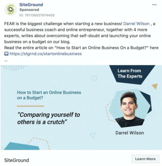
SiteGround, a leading blog hosting provider, starts with a strong emotional word— “fear”. The capital letters command attention to the word and the rest of the sentence.
They start the ad by using an emotional premise, which is the fear entrepreneurs feel when they start a new business. Then, they jump right into the solution—an article where experts share solutions to this problem.
Unlike traditional tutorial pieces that focus entirely on best practices, the ad stresses the expertise of these experienced entrepreneurs and their solutions.
The last sentence adds a CTA that leads to the article, which wasn’t replicated in any of the other ads—this is most likely because this ad promotes an article and not a landing page.
Finally, the company makes smart use of the ad’s image, including the article’s name, the expert’s face, the fact that he’s an expert, and an interesting quote that shows one of the solutions mentioned.
Grammarly
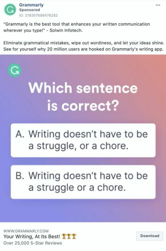
Grammarly, a grammar checker software company, starts their ad with a quote from an authoritative review. They also present their software as a direct solution to their audience’s problem. This combo of social proof and benefit-driven copy gives their ad relevance in the mind of their audience.
What’s even more impressive is how the company used the video in the shape of a short quiz. The quiz proves the central premise behind Grammarly’s software—the importance of knowing your grammar.
As soon as the quiz ends, the video shows a CTA, which matches the ad’s button. The description repeats the beginning of the ad by mentioning the popularity of their product.
Related Content: 9 Tools for Creating Effective Facebook Video Ads that Convert
Calm
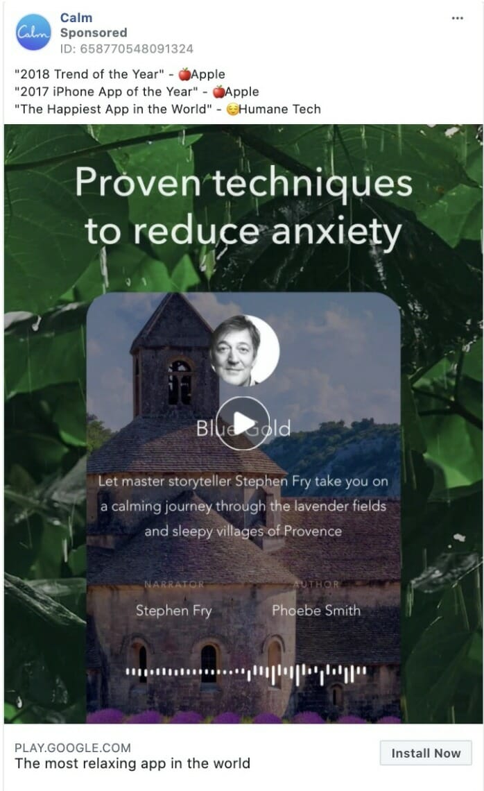
Calm’s ad, which promotes their meditation app, is all about simplicity, which matches their brand. Their ad copy follows the mantra, “show, don’t tell,” by highlighting two important awards they won and a raving review. The rest of the ad shows a 39-seconds video.
The video starts by opening a “knowledge gap”—the fact three-quarters of adults experience stress. As soon as they present this problem, they jump to one of their main features: their guided sleeping stories.
Not only that, but they pack the video with more social proof by showing Stephen Fry, a popular British actor who’s also the narrator, and positive reviews from its users.
Using influencers is a well-known tactic to draw attention to an ad. Even if Fry isn’t a meditation expert, his fame does the trick to project authority quickly.
Using open questions in their video effectively engages their audience, which can positively affect the ranking algorithm.
BigCommerce
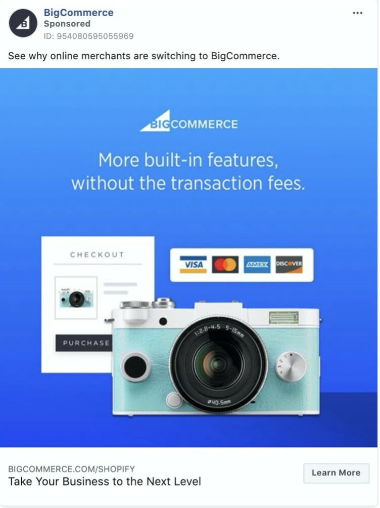
BigCommerce, a leading ecommerce platform, uses a concise and intriguing copy. They don’t explain why online merchants jump to their platform; they ask you to check it yourself.
What’s more, the image’s copy complements this copy by giving a hint to why this happens—i.e., more features with fewer transaction costs. The image also illustrates the features the copy talks about (except for the camera, which doesn’t seem to relate to the ad).
Interestingly, the ad’s URL has the name of its main competitor—Shopify. A click in the ad leads to a landing page that says, “Don’t Hit the Shopify Ceiling.” This compares BigCommerce’s features with Shopify’s, a popular bottom-of-the-funnel content marketing tactic.
By the time you click on the ad to read why BigCommerce says they offer better features than Shopify, it’s already too late: you have fulfilled the ad’s goal.
Pipedrive
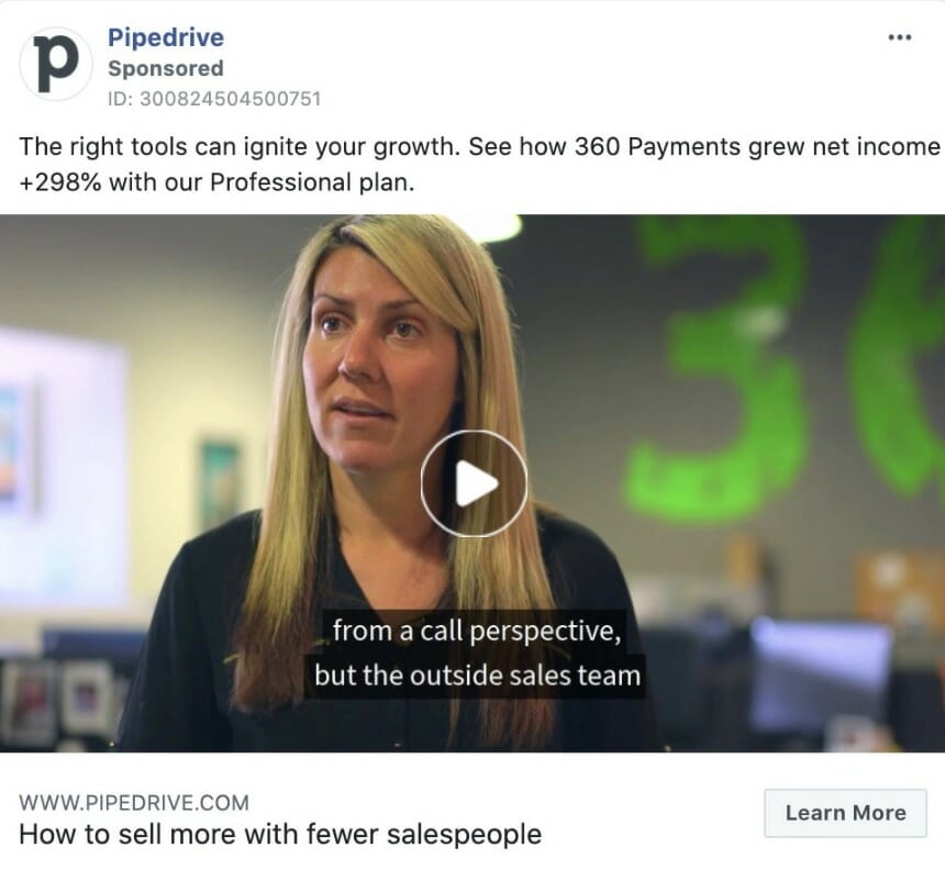
In this ad, Pipedrive, a leading CRM software company, shares a video from a customer success story. Their copy starts by creating a positive association by using the words “the right tools.” More importantly, the ad promotes their customer’s success, not its product.
The ad leads to a case study, not a landing page, a type of content marketing tactic used to nurture leads and drive them down the funnel.
Their emphasis on the results their customers got makes it much easier for the audience to believe Pipedrive and click on the ad. What’s more, the ad description—“How to sell more with fewer salespeople”— makes it almost irresistible for any salesperson to click.
Asana
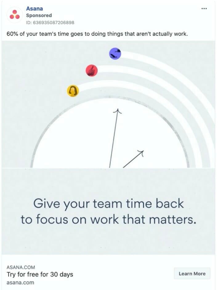
Asana, a project management software company, fuels its ad with a shocking statistic that puts the spotlight on the user’s productivity habits. Once the reader realizes they could suffer from this issue, Asana comes into rescue.
The background color of the ad’s image doesn’t contrast with Facebook’s white background, something that may not be ideal. The ad compensates with the illustration and the copy below it, representing the premise of Asana’s software—giving the time back to its users.
The ad headline features a 30-day trial offer that connects with the primary text; it’s action-driven, and it’s risk-free.
Related Content: 5 Facebook Ads Trends You Can’t Ignore in 2023
Headspace
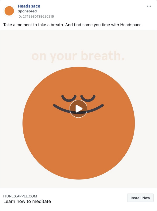
Headspace, a popular meditation app, uses an animated video of a smiling circle expanding and contracting. The video shows you how you can start doing meditation by just focusing on your breath. After this 15-second exercise, Headspace offers a free trial.
There’s a strong value proposition in the primary text, which perfectly connects the ad’s description and its CTA.
This ad represents a perfect match between their main offer—a subscription to their guided meditations—and the ad copy and video.
Sonos
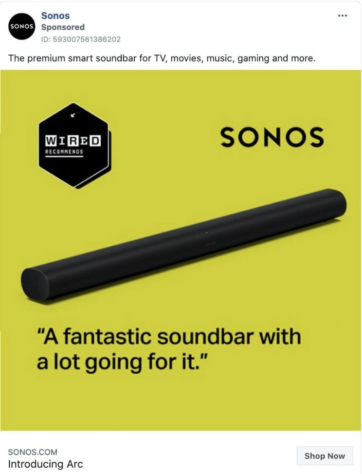
Sonos, a speaker manufacturer, uses a minimalistic ad to promote one of their latest products, which they mention in the ad’s title. Their copy highlights the one attribute its target audience wants to hear, “premium.”
The mustard background is quite different from the bright colors commonly used in Facebook, which probably makes the ad stand out in the user’s feed. The image also leverages the praises the product got from Wired, quoting the words used to describe the product.
CoSchedule
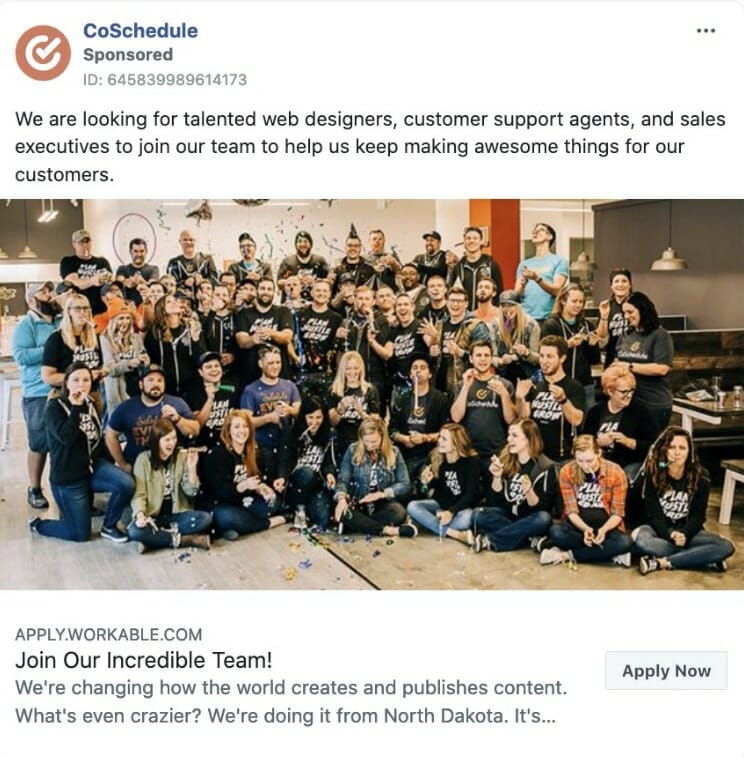
CoSchedule, a content marketing automation company, starts by stating what they want: hire new employees. They are specific on the positions they are looking to fill and clear on their purpose, which is to “help us keep making awesome things for our customers.”
Their image shows their employees and presents them as their “incredible team.” Their headline also matches the primary text and the CTA.
The ad description explains what the company aims to do—change the way the world creates and publishes content. It even adds a fun fact, which is that they are from North Dakota.
The radical transparency the company takes in their ad differs from all of the other ads, and to most of the traditional job posting ads.
Related Content: How to Uncover Your Competitor’s Facebook Ad Strategy
Brooklinen
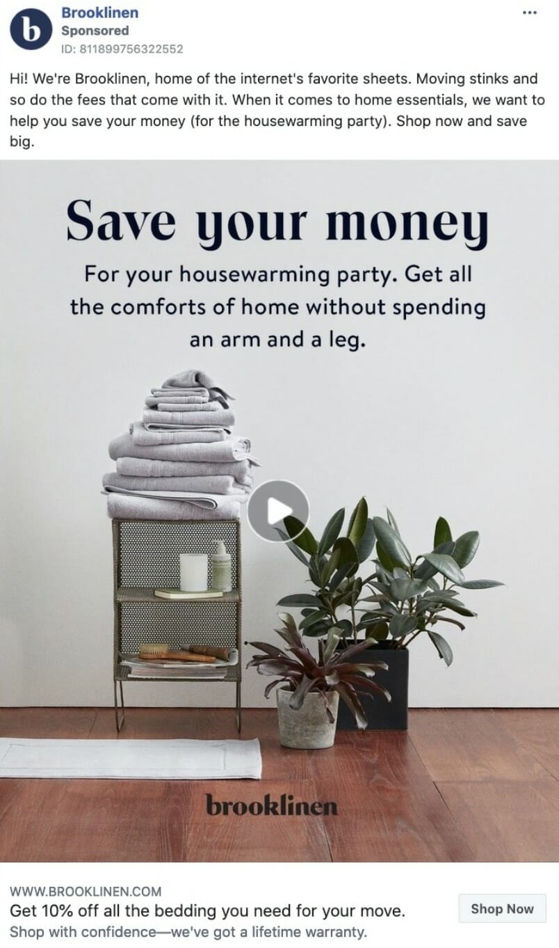
Brooklinen, an online retailer of bed sheets, starts the ad by presenting themselves. It’s a human approach, relatable and transparent. Their copy looks like a person wrote it, which is similar to the approach many brands take to write their product descriptions.
They also put themselves in their customer’s shoes by saying they want to help them save money. More importantly, they make it clear to whom it speaks: to those who wish to celebrate a housewarming party. (These are parties people celebrate when moving to a new house.)
The video shows different pictures of their products. They repeat their desire to help the viewer save money for their housewarming party. The expression “without spending an arm and leg” is also informal and personal.
In the ad title, the company reinstates its offer with specificity—“10% off all the bedding you need”. And their lifetime warranty offer is reassuring. Interestingly, their CTA—“View Shop”—doesn’t put pressure on making a sale, but on shopping.
Coursera
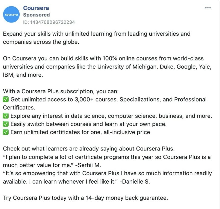
Coursera, an online education company, starts their ad with the one thing the viewer wants to see: the skills they can acquire. An expression like “unlimited learning from leading universities and companies” motivates the target audience to see themselves getting the benefits from Coursera’s courses.
They also mention these companies and universities, which adds social proof to their statements, while their use of emojis, benefits, and student quotes makes it even more interesting to read.
Their ad copy is the longest from this list; it looks almost like a short sales page. This may be due to their offer, which leads to a landing page for a premium subscription, and their target audience, which may not be entirely nurtured.
Their video is a six-second animation that shows the number of courses and photos of their students, both highly reassuring elements in their ad.
Uber Eats
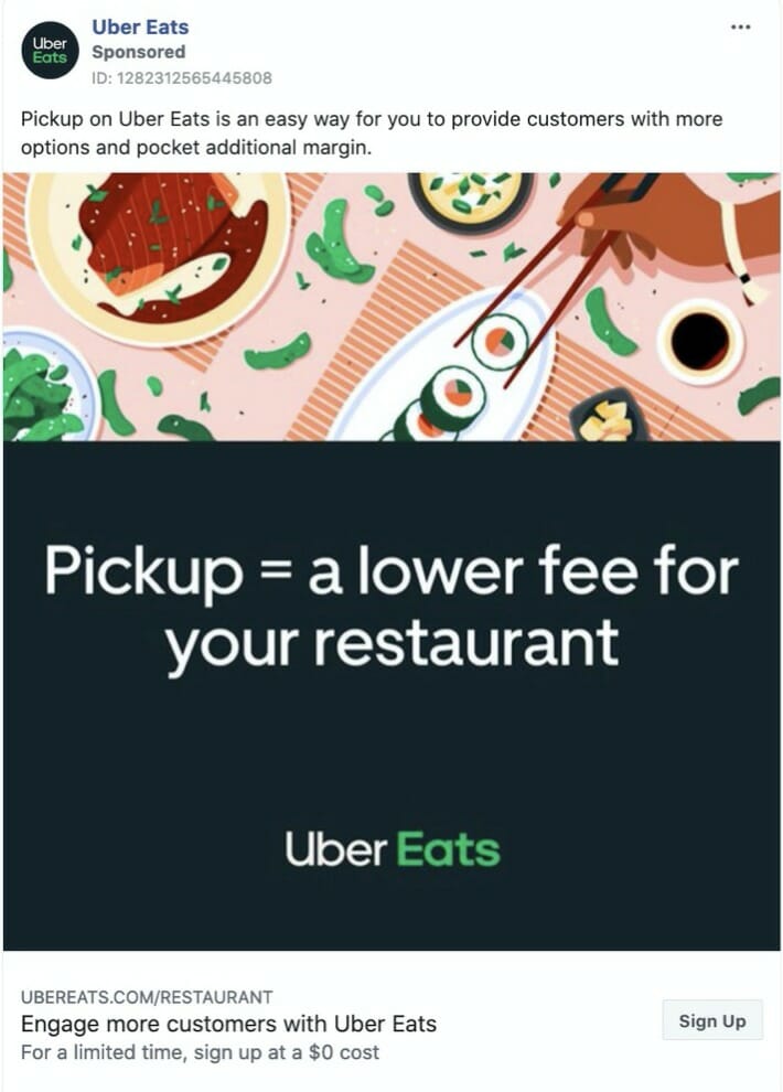
Uber Eats, the famous food delivery company, positions its ad to restaurant owners, one of their two core audiences. The ad focuses on the benefits they get—more customers and profit—and on what their audience’s customers want too—an excellent service experience.
Uber Eats even make this benefit even clearer in their image—you offer a pickup service, and you will save money.
The ad title adds another benefit: engaging with the restaurant’s customers. And they add some scarcity with the “time-limited” offer of free signup.
Related Content: How to Get the Cheapest Facebook Ads Without Sacrificing Quality
7 Learnings from Analyzing Facebook Ads
- Use video. Most of the companies in this list used video, even if it’s a five-second animation of the image shown. People like video; it entertains them.
- Use short copy. Let the ad speak for itself. Use the right offer, so the ad only works to present it—if you target the right audience, this will make the need to “sell” the offer even more redundant.
- Connect your copy with your ad image and headline. The ad should look like a coherent piece that’s all connected by one strong premise.
- Give risk-free guarantees. Remove fear, uncertainties, and doubts fast by using money-back guarantees, warranties, and return policies.
- Leverage social proof. People follow people. If you can back your offer with numbers, quotes, and badges, it will be easier to believe.
- Ask questions. The reciprocity rule tells us that when someone asks you a question, you answer. As subtle as this may seem, using questions in your ads can result in increased engagement rates.
- Be radically honest. Companies like CoSchedule and Brooklinen are small startups aiming to change their respective industries. Their ads highlight their values honestly. If you are a small company, don’t be afraid to say it. Consumers like to follow brands whose values they are aligned with.
Final Thoughts on Facebook Ads Ideas
The dozen ads you saw represent just a glimpse of what you can do with Facebook ads. Most of these ads focus on bottom-of-the-funnel content, but if you want to promote an article or an ebook (top and middle-of-the-funnel content, respectively), there’s a lot more you can do.
Hopefully, these ideas will boost your creativity so you can grab your target audience’s attention and drive them to your landing page.


