Conversion rate optimization is quickly becoming one of the most popular marketing tactics for 2023.
Why? Because it’s one of very few marketing strategies that can increase your sales without spending more on advertising and content marketing.
What is conversion rate optimization? The conversion rate is the percentage of people who land on your website and take the action you want them to take (fill out a form, download an e-book, make a purchase). Conversion rate optimization is simply the process of increasing that percentage by improving the design or UX of your site.
The average conversion rate, across all industries, is 2.35%, but the top 25% convert at 5.31% or higher.
Today, you will learn the top 15 tactics that will improve your conversion rates and get your website into the top 25 percentile.
TABLE OF CONTENTS:
1) Make Sure Your Ads Match Your Landing Page
You need to maintain strict relevance between your ads and your landing page. This means that what you offer in your ads must be exactly what you offer on your landing page.
For example, if you are running an ad that promotes a 25% off sale, that exact sale with that exact language should also be on the landing page to which you are sending potential customers.
You also want to make sure that you keep your branding the same. When I say “branding,” I’m referring not only to your tone of voice and style, but also to the colors, fonts and designs that you use.
Here’s a good example from our video on creating highly converting remarketing ads:
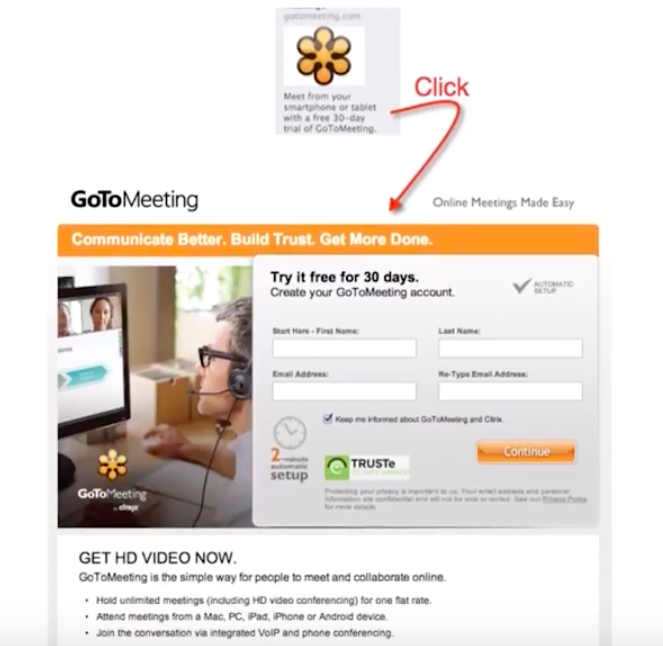
Notice how the colors and logo all match? So it’s not a surprise when you get to the landing page.
The same goes for this example – the colors, font, language and tone are the same in both the ad and the landing page:
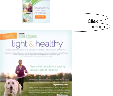
The bottom line is:
Keep your design simple and don’t surprise people when they click through from the ad to your website’s landing page!
2) Clarify Your Product’s Value Proposition
A value proposition is the main reason why customers should buy from you.
What is a value proposition? First impressions are everything, and a value proposition immediately tells your potential customers that you’ve got exactly what they need. It’s essentially your promise to deliver great value to them via clear features and solution-oriented benefits.
This is something you need to make crystal clear on your website and it needs to have a certain sense of urgency so that your customers will feel compelled to purchase your product or service.
In this example from Acadium, potential customers (in this case, people looking for jobs) know exactly what it is they will be signing up for:
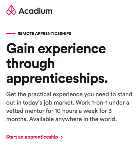
To make sure that your value proposition works, pinpoint the benefits your customers will receive (i.e. how will your product/service make their lives better), what problem you intend to solve, and how customers will differentiate you from your competitors.
Here is the value proposition for business from the same company:

It clearly states exactly what a business would get out of working with Acadium: zero hiring fees, trained and vetted candidates, and trial before you hire.
The layout itself is also very clear with a large, bold headline that uses the word “benefits” and further description underneath.
As most people don’t actually read all your content, it’s important that it can be clearly understood just by skimming.
Dive Deeper:
* How to Increase Your Conversions with Online Customer Engagement
* The Ultimate Guide to Creating a High-Converting Landing Page in 2023
* 11 Companies That Are Doing Mobile Advertising Right
* 11 Proven Hacks to Increase Your Organic CTRs
3) Use Content that Suits Your Specific Audience
This means that the reading and comprehension level of your content should match the people you are targeting.
Be mindful of the language or tone you are using. Your content may seem coherent and rich, but if you’re not getting conversions, perhaps your wording is overwhelming and superfluous for your target audience.
Here’s an example of the language used for a copywriting course. Not only is it targeted for beginners, but it’s also going after the younger demographic (also indicated by the simple drawing):
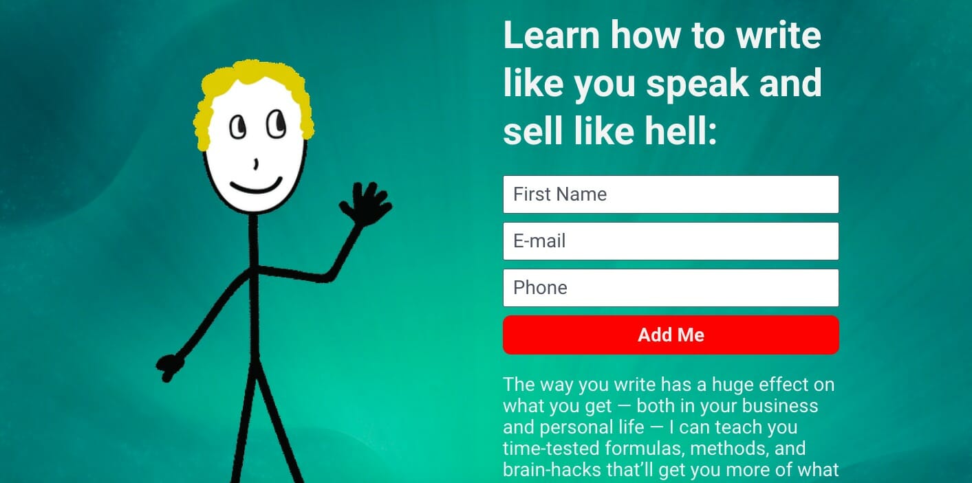
However, this same copy (and image) would be inappropriate if you were a personal injury lawyer. People coming to a legal website like the one below are probably feeling cheated and quite dissatisfied, so the tone here is suitable for this specific audience: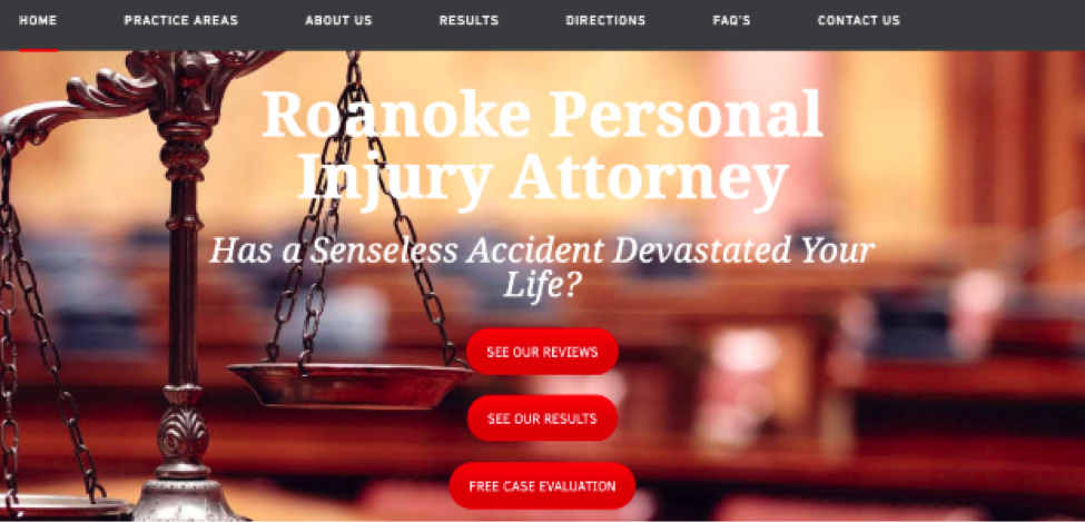
Keep in mind that the tone of voice, or the way that you speak/write, is not the only important element. The words and phrases you use are also important.
For example, if you are talking to doctors, refer to their “customers” as patients, not clients: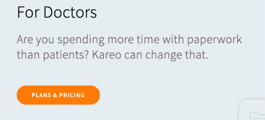
If you’re working in the health insurance industry, brokers prefer to be called “advisors” or “consultants.” So make sure you understand the language and tone that your audience speaks.
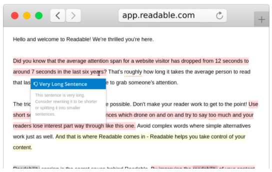
You can also use a tool such as Readable to test the readability of your content:
4) Grab Their Attention with a Captivating Headline
80 cents of your dollar should be spent on the headline.
That’s what copywriter David Ogilvy said and it still holds true today. If you headline isn’t intriguing enough to encourage people to stay, it doesn’t matter how great your content is: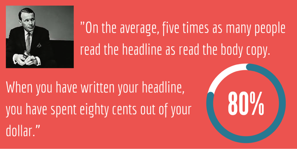
I cannot stress this point enough. The headline is the first thing that your visitors will see – and the only thing if you don’t get it right – so you need to create an excellent first impression. That means your blog, ad or landing page title needs to be concise, appealing and promise something great.
Think of your headline like a movie trailer: it's a short, concise and exciting teaser of what's to come. Share on XKeep in mind that you may have to write a lot of variations before you get one that works. One of Ogilvy’s most famous headlines for Rolls Royce was written 104 times before he felt it was suitable:

According to Copyblogger, “master copywriter” Gene Schwartz spent an entire week on the first 50 words of a sales page.
So what makes a great headline?
Use Statistics
Using shocking or amazing statistics in your headline can intrigue people enough to want to hear more.
It’s no surprise that the CRO agency, Unbounce, uses this tactic as well:
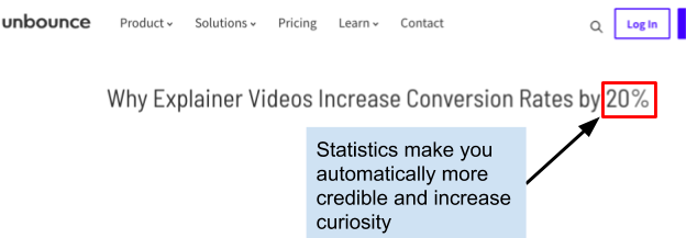
If you can create original statistics, that is a bonus. You can do that with a tool like Survey Monkey.
When using statistics or numbers in your headline, keep in mind that odd numbers tend to perform better than even ones (up to a 20% higher CTR).
In addition, use numerals rather than spelling out the numbers. So in the example above, you wouldn’t write “Why Explainer Videos Increase Conversion Rates by Twenty Percent.” And even though it might pain your high school English teacher, don’t even write out the number at the beginning of the title.
- Correct: 15 Fast and Easy Ways to Improve Your Site’s Conversion Rate
- Incorrect: Fifteen Fast and Easy Ways to Improve Your Site’s Conversion Rate
The Cliffhanger
The cliffhanger is one of the most effective headlines and you’ve probably seen it in popular fashion and lifestyle magazines. Here’s an example from Marketing School:
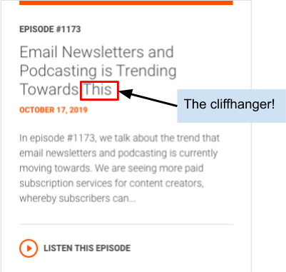
To craft an effective cliffhanger, make sure that you just leave out one critical piece of information. It is usually structured by replacing one informative keyword with “this” or “that”.
Question
Most people are already using questions to create their headlines, but the key is to really understand your target audience and know what questions or problems are keeping them up at night.
Here’s an example from I Will Teach You To Be Rich that invokes a very simple question that people probably ask themselves on a daily basis: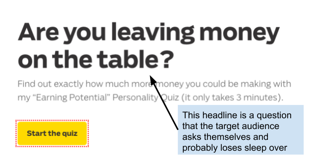
How To and Why Posts
They may be boring and common, but they still work. The key to making “how to” and “why” headlines work is to add in some intriguing specifics.
For example, this video isn’t just “how to rank for lots of keywords.” It includes several specifics that make it both more credible and more intriguing:
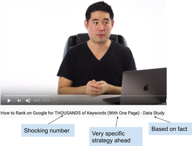
Consider using statistics, time, steps, etc. to make your headline very specific.
Finally, please test your headlines! Just because you think your headline is the best thing since sliced bread doesn’t mean that your customers do. Furthermore, even if you have a good headline, you should always continue improving it as it will eventually get old.
Think of what would catch the attention of your specific customer. If they’re looking to learn something, then a “how to” might work best. Can you incorporate the question that your customers are asking into a headline? Whatever it is, it should be something that will make them want to say yes to your proposition – which is your call to action.
Check out a few of our most popular “how to” headlines:
Dive Deeper:
* Copywriting Hacks: How to Build Trust With Your Audience
* How to Use UX Testing to Improve Your Customer Lifetime Value (CLV)
* How to Boost Conversions with Your Article’s Featured Image
5) Post Reviews & Testimonials for Credibility
Testimonials and reviews are vital when it comes to gaining credibility in the eyes of your visitors – especially first timers to your site.
Understand that social proof – the psychological phenomenon that makes a person believe that their behavior is “correct” based on the actions of the people around them – is fundamental to converting your leads.
- 91% of online consumers aged 18-34 trust reviews as much as a personal recommendation.
- On the other hand, 94% of consumers say that negative online reviews has caused them to avoid a business.
So make sure that you use genuine reviews and use only credible customer review sites because 60% of consumers look to Google for reviews.
For B2C companies, have reviews up on sites like:
For B2B companies, have reviews up on sites like:
Now that we have established their value, how do you go about getting customer reviews and testimonials?
If you are a service-based business and have a working relationship with your clients, it is very easy to get testimonials from happy clients. The account manager can simply reach out and ask.
But let’s say you have zero clients/customers. How do you get testimonials to get those first few sales?
First of all, you might want to turn to influencer marketing:
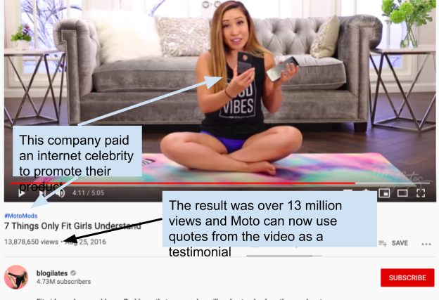
If you don’t have the budget to pay an influencer, consider talking to friends and family and offer your product at a discounted rate in exchange for a review.
If you already have customers, you can also offer incentives, like prizes, to people who leave reviews. In addition, offer incentives for people to leave pictures with their reviews. A product review like this will drastically increase your conversion rate: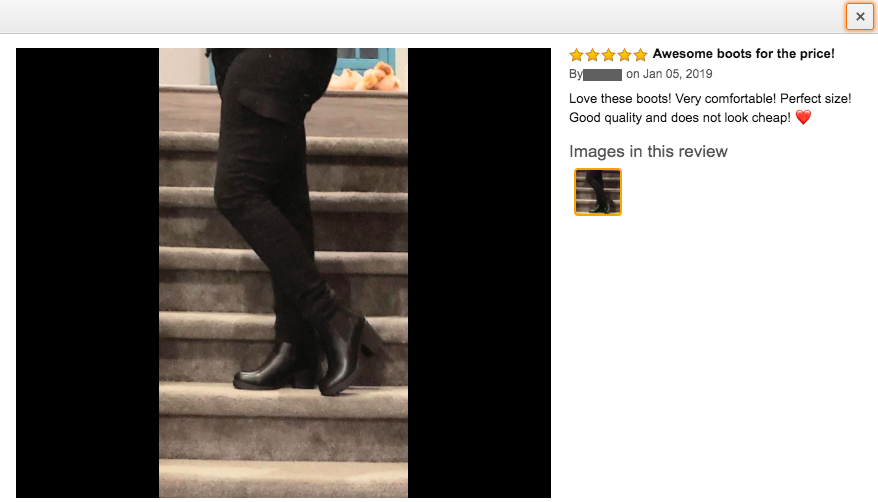
If you are a service-based business and don’t yet have any testimonials, consider doing work for free in exchange for an honest testimonial.
Dive Deeper:
* What Should You Do When People Complain About Your Product or Service?
* The Kick-Ass Guide to Increase Customer Reviews for Your Online Store
* How to Use Amazon Reviews for Content and Product Development
6) Add Trust Badges on Your Website
Another important element to get people to buy from you is adding trust elements to your website. A few trust signals you need to have are:
- Contact information (e.g. contact page, email, phone number, live chat)
- Social profiles (e.g. Facebook, LinkedIn, Twitter, Instagram)
- Payment assurances (e.g. various payment methods, trust badges, certifications, SSL)
What is a trust badge? Something you likely see every day:

In addition to helping improve your site’s conversion rate, these trust signals also help with your SEO. Google only wants to show websites that it trusts, so doing these things is a double win:
You can also build your blog and share your organization’s expertise. An updated blog is a sign that your website is active, and an active site is a sign that your company can be trusted to do a good job. If you haven’t posted any blogs since 2014, people won’t trust you.
If you are an e-commerce store, consider adding trust badges as well. Strategically positioning them by your CTAs will also help increase conversions: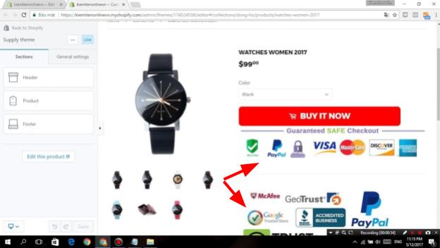
Dive Deeper:
* How Poor Website Security Negatively Impacts SEO Rankings
* How to Keep Your E-commerce Site Secure Against Cyber Threats in 2023
* 4 Ways to Signal to Google that You’re an Expert Content Creator
7) Be Transparent about Your Products & Services
Today’s consumers are very smart so you need to be transparent and straightforward. Here are a few things you can do to optimize your product or service presentation.
Avoid using absolute words. Here are some examples of absolutes:
- The best
- The only
- Perfect
- Impossible
In this example of brands selling chocolate chip cookies, do you see how these headlines have cancelled each other out?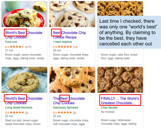
As a consumer, you’re likely to think that they are ALL boasting unnecessarily. The only exception to this is if you have actually won an award or have some other proof to your claim of being #1 or the “best of 2019”. In this case, be sure to include that award in your copy.
The key to great copywriting is that you're just answering people’s questions. Share on XWhen you started your business, what was the pain point that you felt wasn’t being addressed? Just state that in simple terms rather than making outrageous claims.
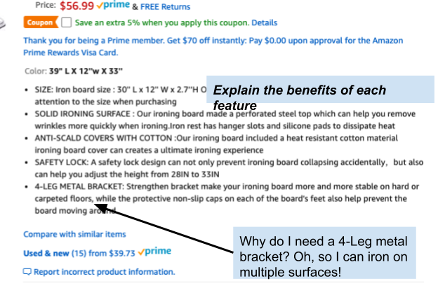
In addition, state the benefits of your product. Rather than just stating a feature (the “what”), explain why it will help the consumer:
Don’t write anything that is overly complicated, as that will dim your transparency (or just be boring to read).
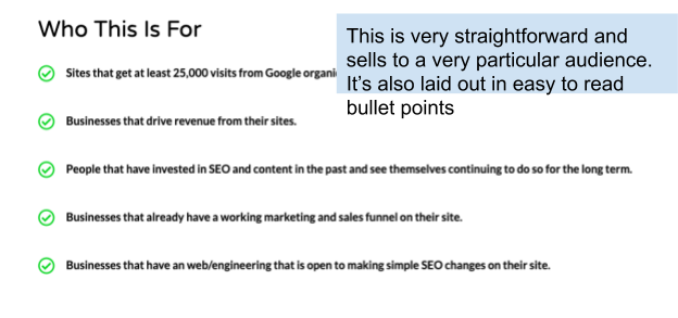
Take advantage of bullet points, lists and charts. Avoid having any text that is a paragraph of more than three lines.
8) Create CTAs that Actually Cause Action
Simply put, your Call to Action needs to be the magnet that captures your visitors.
When creating your CTA buttons, split testing (or A/B testing) elements such as button placement, color and copy is key to finding out what works best: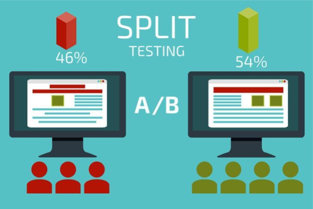
You may find that including a CTA on one side of your website works better than the other side. And although button placement may affect your conversion rate to some extent, your actual offer will have a greater impact.
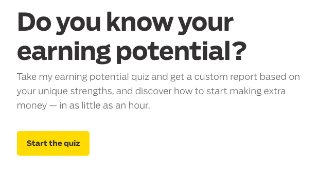
Consider how long your buying cycle is. If you are offering an online course, you may just want to get their email and warm them up so that you can later present them a $2,000 product.
Ramit Sethi does this with all his courses. There is no option to buy a course on his website – it is all done through email, so his CTA is a quiz that will give him your email address:
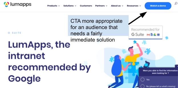
If you have a software solution for which people need an immediate solution, you might ask them to try your demo, as with this example with LumApps:
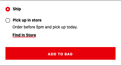
A CTA appropriate for an e-commerce website would be an immediate request to purchase, i.e. “Add to Bag,” “Add to Cart”, etc.:
In addition it’s important to think about the words that you use for your CTA.
For instance, you can either use a strong verb to describe the action they should take (e.g. “Download now!”) or make it more results oriented (e.g. “Show me how to boost my conversion rate”).
Always use the active voice rather than the passive voice. SmartBlogger has a list of the seven types of power words that will really strike at your market’s emotions and nudge them to click:
- Fear Power Words
- Encouragement Power Words
- Lust Power Words
- Anger Power Words
- Greed Power Words
- Safety Power Words
- Forbidden Power Words
Dive Deeper:
* How to Run A/B Tests that Actually Increase Conversions
* How to Create Better-Converting In-Content Calls to Action (CTAs)
* 5 Important Landing Page Elements You Should Be A/B Testing
9) Visual Appeal Is a Must
While the copy and placement for CTA buttons are important, you also need to take into consideration its visual appeal.
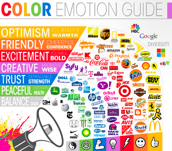
As with other aspects of marketing, psychology plays a huge role in creating CTA buttons. In fact, the psychology of color is a subtle yet powerful way to use emotion to make your customers convert:
- Red — aggressive, urgent, passionate
- Orange — energetic, playful, affordable
- Yellow — friendly, happy, attentive
- Green — growing, prosperous, natural
- Blue — trustworthy, inviting, calming
- Purple — luxurious, royal, sensual
- Black — sophisticated, edgy, mysterious
- White — clean, innocent, healthy
- Gray — formal, gloomy, traditional
- Pink — youthful, feminine, romantic
- Brown — rustic, stable, manly
To find out the best color for your buttons, this again goes back to performing extensive A/B tests. Refer to your buyer persona to find out which color affects your audience in a positive way.
Here are a few color references by brand to help you out when deciding which colors would be most useful:
10) High-Quality Images Are the Most Important Element
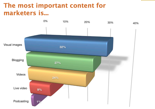
According to a study from Social Media Examiner, 32% of marketers say that visual images are the most important form of content for their business, with blogging in at second place (27%):
So instead of just providing text-heavy blog posts, web pages or landing pages, break up that wall of writing with images, videos or helpful screen grabs to keep your reader engaged until the end of your post.
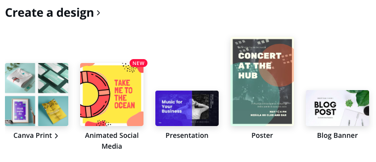
If you don’t have the budget to hire a designer or create custom images, it’s easy to use a tool like Canva, which allows you to create free custom images with easy-to-use templates:
In addition, try to avoid using stock photos. These often look unprofessional, impersonal and overused. Instead, try to take advantage of using screenshots or even occasionally sharing industry charts, graphs and infographics.
11) Chatbots Are Your Friend
The good thing about today’s technology is that there are a lot of available chat tools that are very affordable. Offering this feature allows the customer easy access to you so that they can get their questions answered instantly, which then builds more trust.
Chatbots can:
- save up to 30% in customer support costs
- work 24/7 without a break
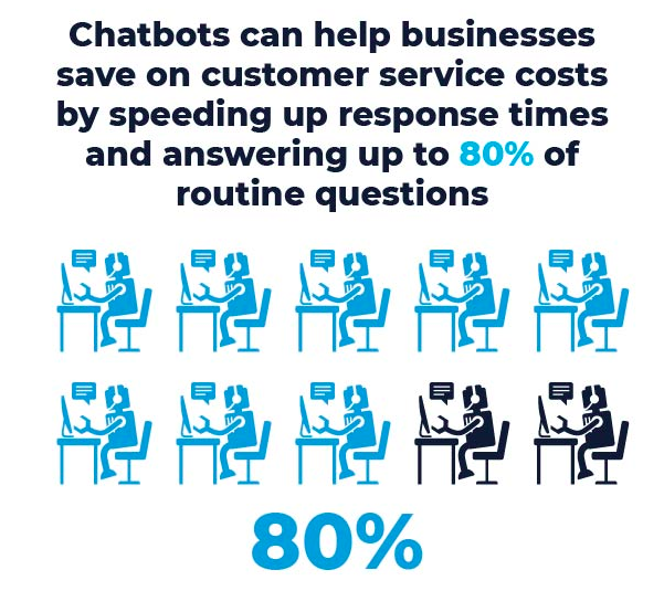
- speed up response times and answer 80% of normal questions
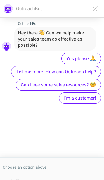
Using a tool like Intercom can also help you direct people to what they need by using a very accurate chatbot. Once the bot can no longer help, it will turn direct the query to one of your sales people, like this Outreach bot:
Dive Deeper:
* Why Chatbots Are a Must-Have for Businesses (and How to Build One!)
* 13 Messages Your Chatbot Should Be Saying to Prospects
* How E-commerce Companies Can Drive Sales with Facebook Messenger Chatbots
12) Help Spread the Word with Social Sharing Buttons
Including social sharing buttons on your product pages is a double-edged sword:
- On one hand, it can boost the credibility of your product or blog post, as per the social proof phenomenon.
- But if it does not have many shares, it can backfire and give the impression that your content is not trustworthy (i.e. negative social proof).
To find out if this is the case for you, conduct an A/B test.
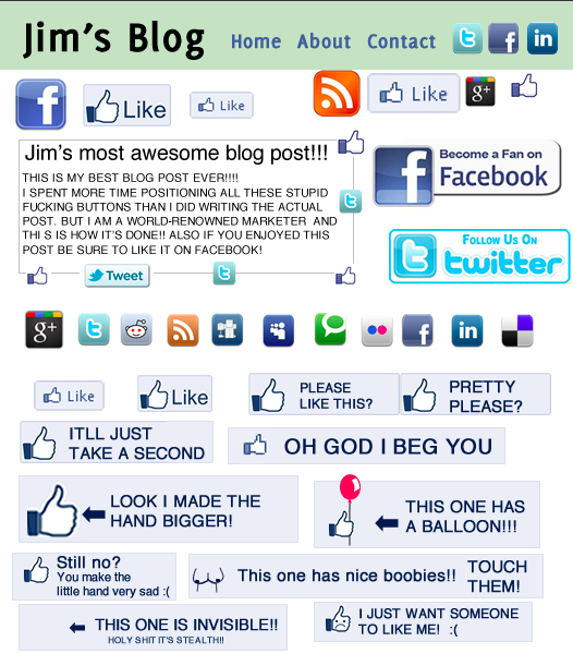
Make sure that you only provide social sharing buttons for platform-appropriate content (e.g. Pinterest for images, Twitter for quotes or snippets, Facebook for blog sharing). Including too many buttons can be overwhelming and also looks a little desperate:
Testing the placement of your social buttons is another option worth doing. It might not be a top priority, but it still may have some effect.
Some people think that putting social buttons at the bottom of the article is a good idea (because the people most likely to share it will have read to the end), but you should also test it at the top of the article (because some people will share an article just by reading the headline).
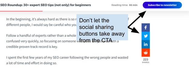
Finally, the social sharing buttons should not distract from the main CTA button, as this could decrease your conversions:
13) Make It Easy to Pay with Several Options
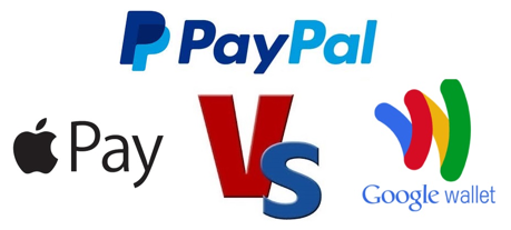
You need to cover all the bases when it comes to payment, since not everyone has a credit card.
Other payment systems include PayPal, Google Wallet, Apple Pay and Amazon Payments. By providing alternatives, you are decreasing cart abandonment issues due to failed payments.
14) Improve Your Email Marketing Campaign
Your email list is one of the best ways to nurture your leads and drive them further down the funnel.
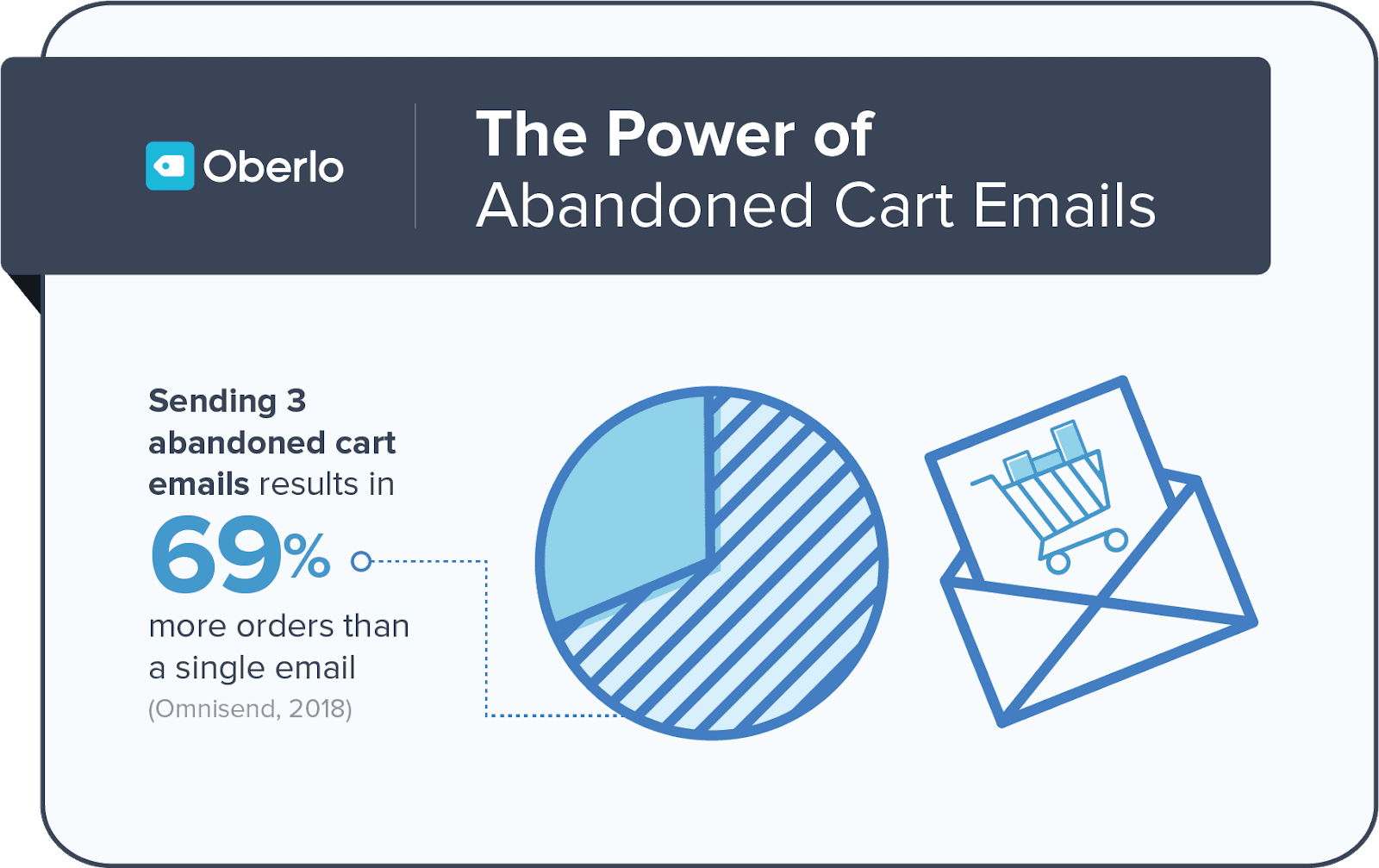
To improve your email marketing, consider using multiple abandoned cart campaigns. Statistics show that sending three abandoned cart emails increases conversions by 69%:
If you’re looking for more ways to spice up your content, consider these top email strategies that Litmus compiled in a poll:
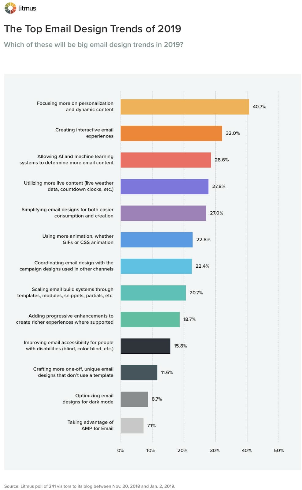
Personalization and dynamic content was a clear winner, with interactive email experiences and AI coming in second and third respectively.
If you are struggling to grow your email list, reconsider the value that you are offering to the customer. You could:
- Host a free webinar and offer the recording as an opt-in incentive
- Offer a subscriber-only discount and, of course, make it clear what the benefits are for signing up (e.g. valuable content, exclusive promos)
- Go the traditional route and put out a sign-up sheet at a trade show or event
The key here is to figure out which strategies work best for your business model and double down on them.
Dive Deeper:
* 14 Ways to Kickstart Your Mobile Email Marketing Campaign
* How to Use Personalization to Increase the Impact of Email Marketing
* How to Get More Responses From Your Cold Emails
15) Do Not Force the Customer Create an Account
In 2023, many successful e-commerce sites are offering express check-out to expedite the buying process. Avoid adding multiple steps, like creating an account first.
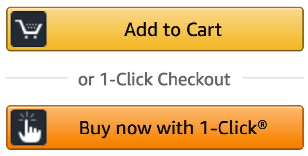
This is one of the reasons why Amazon’s one-click pay has become so successful:
In fact:
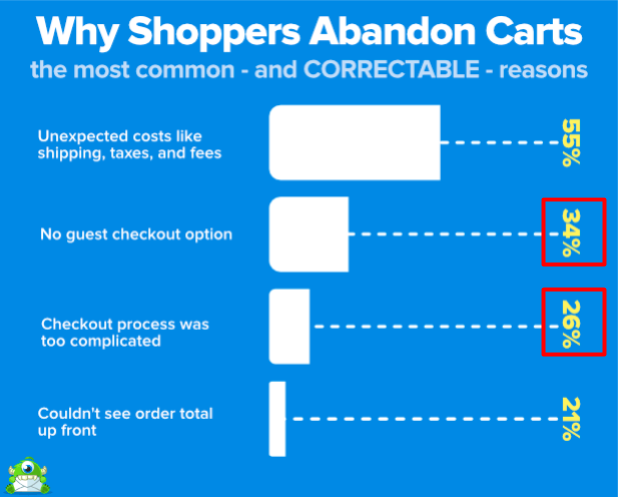
- Complicated checkout processes are responsible for 26% of cart abandonments
- 34% of abandoned carts are caused by no guest checkout option
While there are definite advantages to having your customer details (e.g. faster shopping in the future, track deliveries, access to exclusive promos, etc.), there are ways to include a registration page without being disruptive.
Make creating an account an optional step for buyers. You can also highlight the benefits of registration on your website (e.g. promos, exclusive content).
Dive Deeper: What Amazon’s Marketing Strategy Can Teach SMB Owners
Final Thoughts
Think about all the money you put into generating leads. But how are you treating those leads once you have captured those precious few? Doesn’t it make sense to put just as much effort, if not more, into nurturing the people who cut through the noise to talk to you?
So which tactic are you going to use first? Are you going to improve your email campaigns or establish more credibility with our pro tips?
