If you’ve been around the digital marketing arena for more than one day, you’ve heard people talking about landing pages as if they’re one of the most important parts of your website. Spoiler alert: that’s because they are.
However, just because they’re important doesn’t mean that the average person understands how to use them. Even good marketing people don’t always understand how to design landing pages that convert prospects into customers.
So what’s the secret? There isn’t one. But there is a process that includes several different elements that can take your landing pages to the next level. In this article, we’ll share that process – the keys to designing landing pages that convert from start to finish.
What Is a Landing Page?
It’s quite simple. A landing page can be defined as a standalone web page created specifically for a marketing campaign. Unlike other pages on your site, this one has a single purpose and focus. Essentially, it’s a page built apart from your normal website, and it uses the right offer and persuasive elements to get the user to perform a specific action.
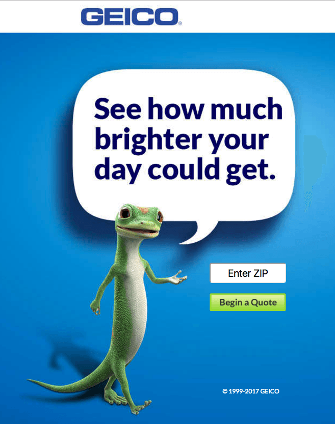
A great example is this Geico landing page. Its simple call to action stays on brand and gives the reader only one choice: “Begin a Quote”. The logo is not hyperlinked, so the user really has no exit points. They either follow the simple and catchy CTA or they leave the page.
Your landing page will have just a few elements:
- A headline that speaks to the offer
- Some persuasive language explaining the value of the offer
- And a clear form that allows the user to get the offer
There will be no links to your home page, your blog or other navigation elements usually found on your other web pages. Any images will be relevant and, ideally, show your product in action. This landing page from Moz is another great example. It contains a relevant image that shows what using the product will be like, a CTA button that stands out, and social proof at the bottom that encourages the user to follow through.
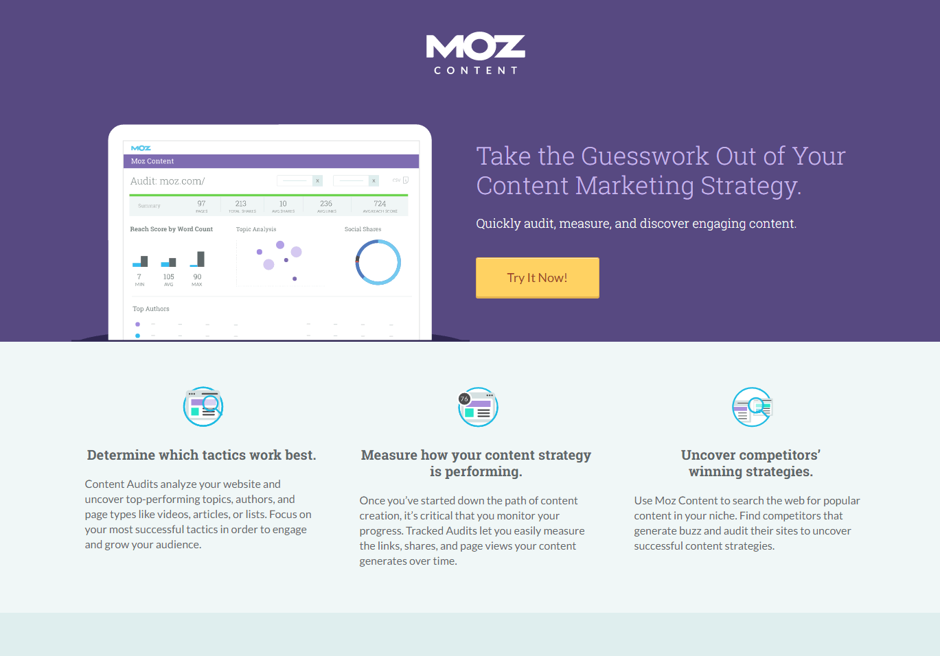
That’s it. A landing page is designed to be simple and to the point, leading the person who landed on it to take one specific action – in this case, to provide their email address in exchange for Moz’ e-book. But landing pages can also lead a person to make a purchase or even call your business.
Dive Deeper:
- The Ultimate Guide to Creating a High-Converting Landing Page in 2019
- Marketer’s Guide to Landing Page Optimization
- How to Use Scarcity on Your Landing Page to Skyrocket Conversions
How to Pick a Landing Page Builder
How do you create landing pages? Well, you can build them from scratch, but that can be time consuming and the labor cost can really eat into your ROI. Why pay your marketing personnel when there are a lot of good landing page builders out there? But then how do you choose the one that is right for you?
Well, there are a few things you should look for in any landing page builder:
- Great Templates: Templates should be easy to use and edit, and visually appealing, so if a landing page builder does not have these, move on. Templates that require too much editing will waste your time like a Netflix binge.
- Mobile Optimized: That should go without saying in today’s market. Depending on who you ask and your customer base, about 50% of searches are done on mobile devices. A landing page that is not optimized for every device it is viewed on is pretty useless.
- Integrations: What good is a lead if you can’t do anything with it? Your landing page builder needs to integrate with lead nurturing software and your CRM. Your goal is to convert more leads and sales from your ad spend and if it doesn’t help you accomplish that, it’s about as useful as a steak knife at a vegan cafe.
- Multiple Users: Maybe you’re a small company, but even so, your landing page builder needs to give you the ability for more than one person to be working on landing pages at the same time.
- Testing Ability: You A/B test your ads right? Yes, and you’ll A/B test your landing pages, too. We’ll talk about that in a little bit, but if your landing page builder doesn’t have this ability as part of its platform, move on.
Other features that aren’t a necessity but are awesome to have include countdown timers that indicate when the offer expires and the ability to create website pop-ups. The more easily you can customize the landing page to meet your specific needs, the smoother your ride will be.
There are several good landing page builders, and they will each tell you they are the best. The key is to compare two things to determine which is right for you: the features listed above and the price.
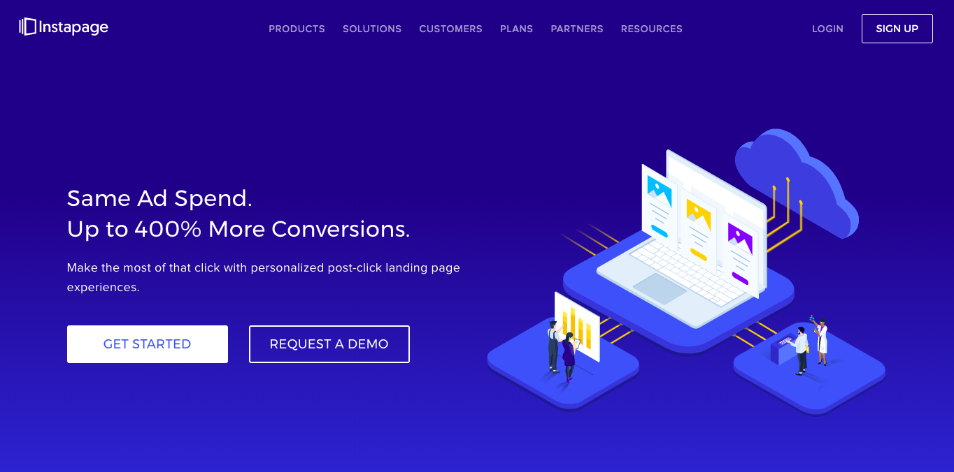
Instapage is the highest-rated landing page builder. It directly integrates with WordPress and comes with over 200 templates out of the box. It is truly a drag-and-drop builder and making landing pages mobile responsive takes only moments.
Unbounce is very similar in the features department to Instapage, with a few minor differences. Both integrate well into WordPress and both can send contact information to various CRM software, including MailChimp and Salesforce.
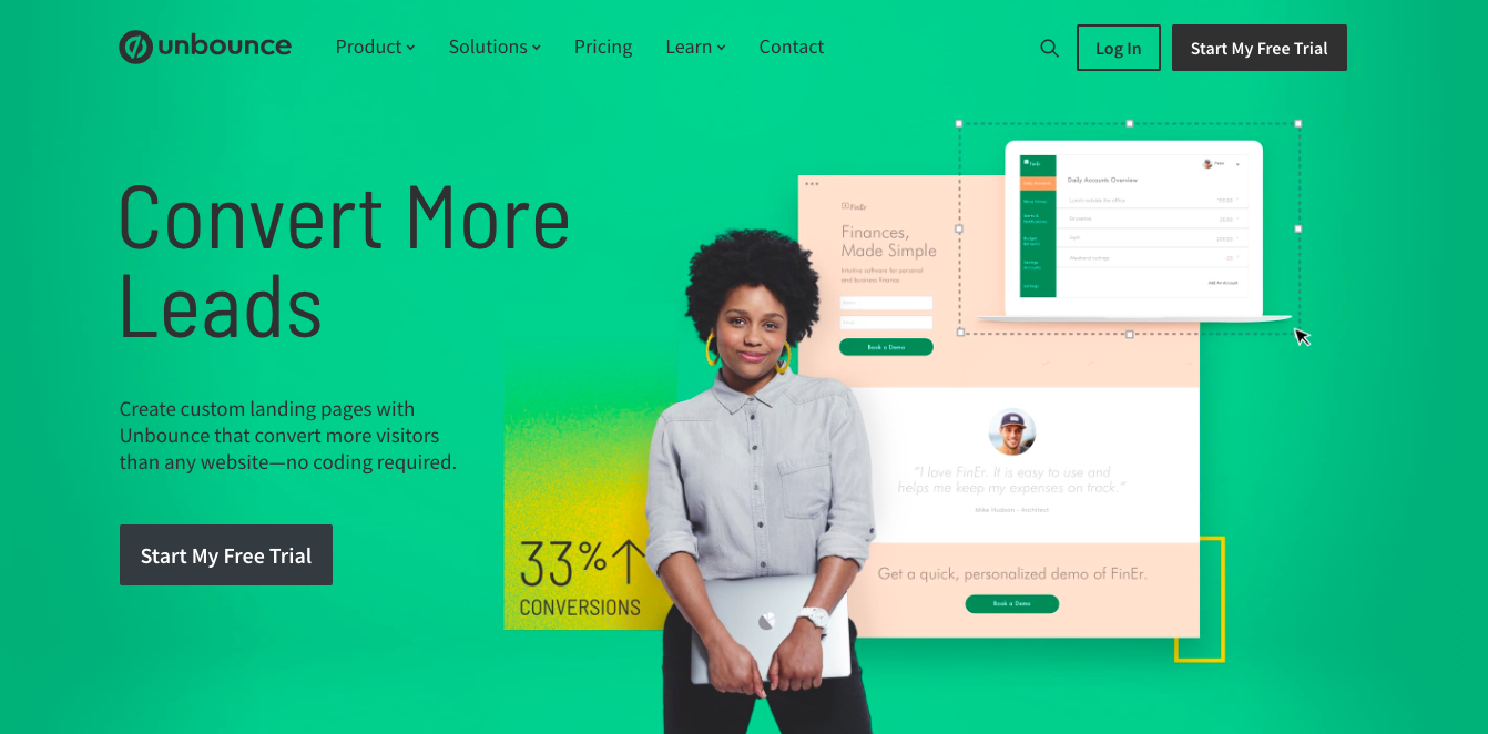
When it comes to price, these two builders are very similar:
- Instapage starts at $99 a month. The more robust Agency and Team plans start at $179 a month and go up from there.
- Unbounce starts at $79 a month for the basic plan and the premium plan is $159 a month. Enterprise-level plans start at $399 a month. When you sign up for Unbounce using our link, you will receive 20% off your first three months or 20% off an annual plan!
This is where a program like Landingi comes in:
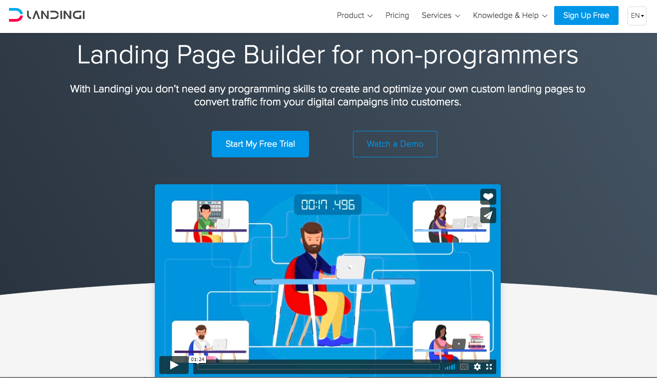
There are fewer templates than the other two programs I mentioned and the editor is a bit more challenging to use, but plans cost $29 a month, $49 a month and $109 a month. It is a viable landing page builder for those on a budget, but won’t have the high-end capability of other builders.
Remove Navigation Elements
You may be scratching your head and asking: Why remove the navigation elements from your landing pages? Don’t you want users to explore your website? Well, no. In fact, leaving navigation elements on your landing page will kill your conversion rates. Let’s look into why.
A landing page has one purpose, and that is to get the user to take a single action – the reason you created both the campaign and the landing page itself. By giving users other choices, you are reducing the likelihood that they will convert. People are easily distracted.
Despite the data-driven proof behind this, many marketers design their homepages like a post-click landing page. They’ll even direct clicks to another page on their website that still has navigation elements intact. This includes the footer of your website pages, too, with all the links that lead to the contact, about us, and other pages. When we say remove all the navigation elements, we mean all with very few exceptions.
The only exceptions should be the healthcare industry and other Google-classified YMYL (Your Money or Your Life) sites, where removing the “About Us” section from the footer of your landing pages can anonymize your business too much. This can cause mistrust on the part of not only the user, but Google as well.
The reasons for removing the rest of the navigation links, though, can be broken down to two simple ones:
- Every page on your website has a different purpose, and that purpose may have nothing to do with the campaign you are running.
- PPC ads cost you money. If someone clicks away from your landing page using your navigation elements, that click actually costs you money.
Links are a potential distraction. The user has come to your landing page for a reason. The only options they need are to either perform the action you want them to or to close the page. If you’ve done everything right, the user will not even be tempted to take the second route.
Write a Spectacular Headline
Now that we’ve covered what you need to remove, let’s see what a good landing page includes. Think about the ads and headlines you see every day. Which ones compel you to click on them? Most of the time, they have the same elements.
- They are specific. They describe a single product or service, not a brand.
- They are brief. Think short, sweet and to the point.
- They offer a solution. The product/service described is desirable to the target audience, and because the headline outlined their want or need well, the prospect clicked.
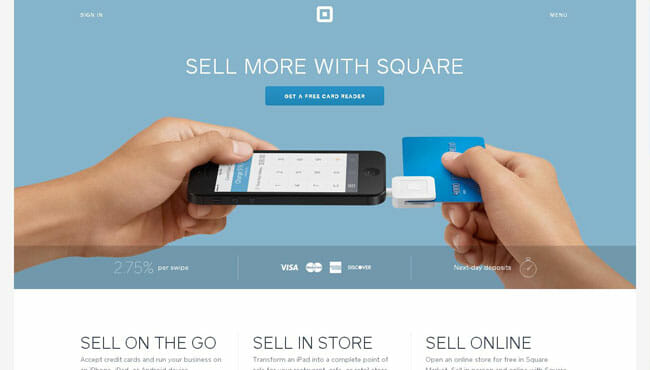
If you can address one of your audience’s pain points in the headline, that is even better. Let them know how you will solve the issue with your product or service, like this page from Square that simply says “Start Selling Today“.

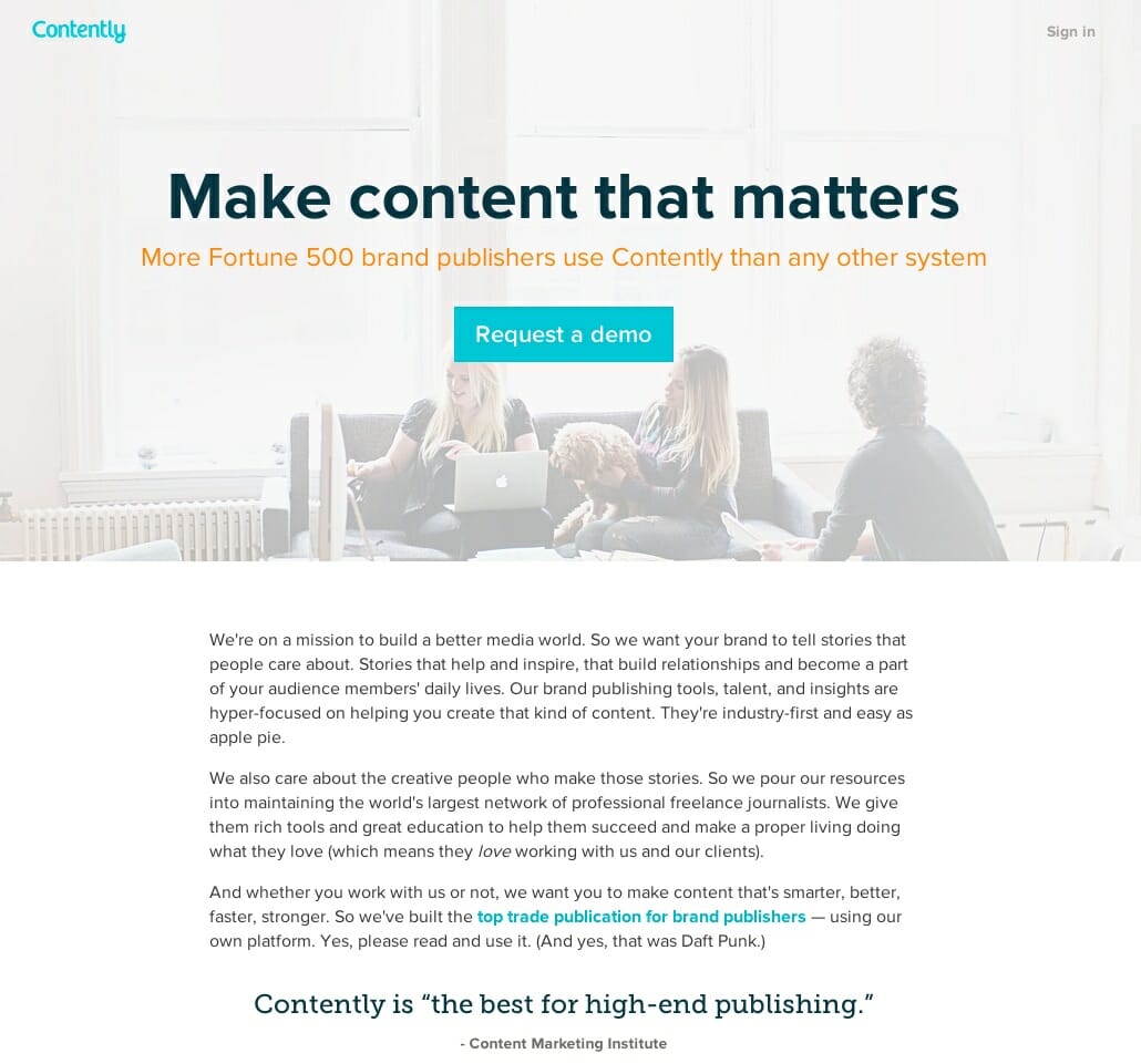
Here is another great one from Contently: “Make Content that Matters.” This might be an easy sell because every brand wants content that matters, but they include social proof that Fortune 500 brands use it and provide a demo.
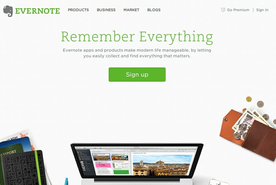
Finally, here is another great headline from Evernote: “Remember Everything”. We all live in a fast-paced world where it is easy to forget things and this meaningful headline and simple solution grabs the reader’s attention.
On the flip side, look at this awful headline from the post office: “Still Relevant: A Look at How Millennials Respond to Direct Mail“. It reads more like a newspaper article or blog post title:
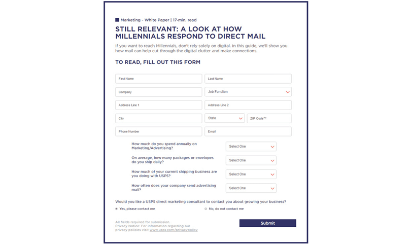
Be sure that the words you use encourage positive action. Rather than “Stop Wasting Money and Missing Tax Deductions,” Quickbooks used “Get Organized, Save Time, and Find Tax Savings,” which creates greater conversion rates through words that inspire action rather than stopping action.
The key making your headline compel the user to stay on the page and click on your call to action. That is its only purpose.
Dive Deeper:
- How to Design the UX of a Website or App to Increase Conversions
- 7 Mistakes in UI and UX That Are Costing You Engagement
- Making Data-Driven Decisions for Better Website UX
- How to Write Hero Headlines to Skyrocket Click-Through Rates
Presentation of Your Headline
How you present your headline also matters. White on a dark background or dark colors on a white background help the headline pop and draw the eye to it. Also, pay attention to the psychology of color, not just in your headline, but in your overall landing page. Different colors promote different emotional reactions from users, and you can use that to your advantage.
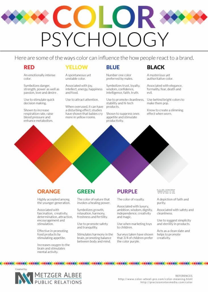
Red means danger, strength, power and passion, and can “stimulate quick decision making” in a user. On the other hand, blue symbolizes trust, loyalty, confidence and truth, and is thus better for enticing that same user to take a yoga class or a vacation in Mexico. Orange, which is popular with the younger generation, is associated with creativity, determination, encouragement and stimulation, and is suitable for marketing children’s toys.
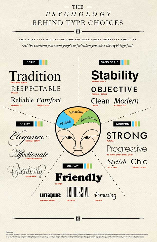
There are other elements that go into headlines as well, such as the font you use: “Don’t underestimate the power of picking the right font design and it’s deep psychological impact it has on your visitors. Experienced designers understand this and pick their fonts very carefully and deliberately.”
Like colors, the typography of your landing site also has an emotional/psychological effect on the reader:
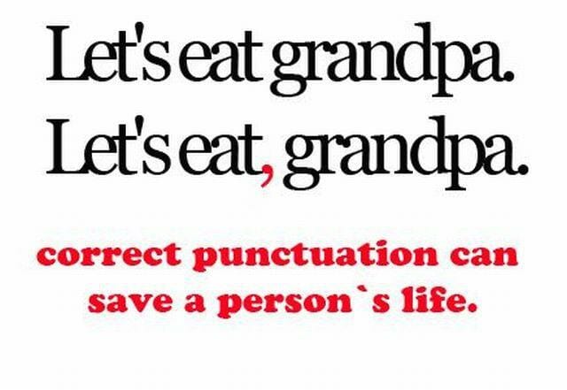
Punctuation and grammar is also important, as one small mistake can alter the entire meaning of your words (and save people’s lives!):
This also raises the need for proofreading. Have people who are not in your marketing department go over your headlines and copy, looking for errors. This can save you some potential embarrassment and the cost of recreating those pages.
Persuasive Subheads
Every headline should have a persuasive subhead. These need to have the same positive message as your headline, but they can be longer. They should also be in more of a sentence format so they can offer additional information.
Basically, the subheadline is designed to do two simple things:
- Expand on the main headline
- Offer more details or more incentive for the user to take action
Let’s use the Quickbooks example above. Following “Get Organized, Save Time, and Find Tax Savings,” the landing page subhead is as follows: “Customers find on average $3,534 in tax savings per year.” This sentence expands on the last half of the headline and offers something of value to the user.
Note that the headline and subheadline are always above the fold (the first thing that the user sees), and both help justify the user’s click on your CTA, like this Medium page:
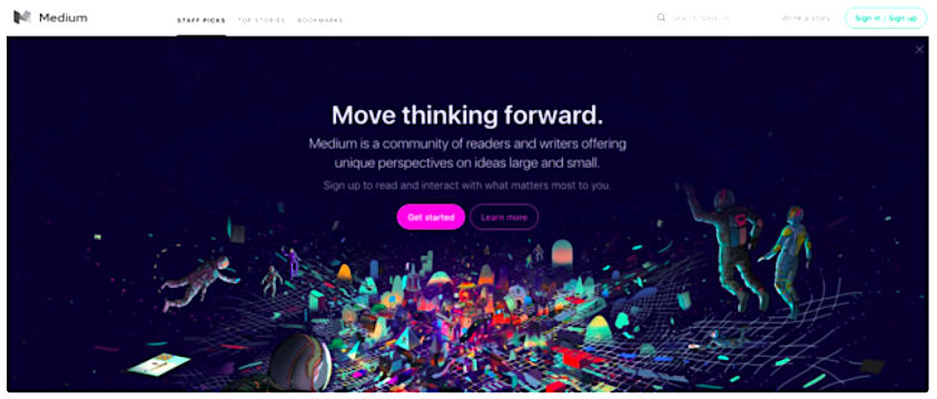
Persuasive and well-written subheads inspire users to keep scrolling to the other parts of your landing page — the place where they take action.
Dive Deeper:
- How to Write Lead Nurturing Content: 7 Proven Tactics
- How to Write Content for People and Optimize It for Google
- 3 Advanced Ways to Write Content that Converts
Social Proof
One of the other essential elements of a landing page is social proof, which is designed to prove through testimony that the claims in your headline and subheadline are true. Social proof can consist of one or more of the following elements:
- Customer testimonials: Direct quotes from customers about their experience with your product or service.
- Industry awards: Accolades and recognition from various sources, including local business, your industry, and general business awards.
- Customer reviews and ratings: Can be from various sources from Google and Yelp reviews to your own website.
- Logos of companies you have worked with: These should include name brands and businesses that your audience will recognize.
- Download or customer counters: The number of times someone has downloaded your offer or the number of customers you have. This should be an active counter, measuring changes as they happen.
Social proof can also be included in other text and rather than set apart in a special area of your page. “Customers find on average $3,534 in tax savings per year” offers social proof in the subheading, and since Quickbooks is well known and used by a lot of businesses, they have some trust built in.
That’s what social proof is about: Letting your leads know they can trust you to meet their needs and fulfill the promises you have made.
Relevant Pictures
The top part of your landing page is often called the hero section, and it’s where the potential lead sees your product meeting their needs or wants. Relevant photos should be hero photos. They need to be relevant and show your product or service in action.
A great example is PayPal invoicing. Clicking on the ad leads you to a page where you see an invoice on a mobile device and on a tablet. This photo alone supports the text on the page by showing that you can create and send invoices in their app or on your tablet (or smartphone or laptop, presumably).
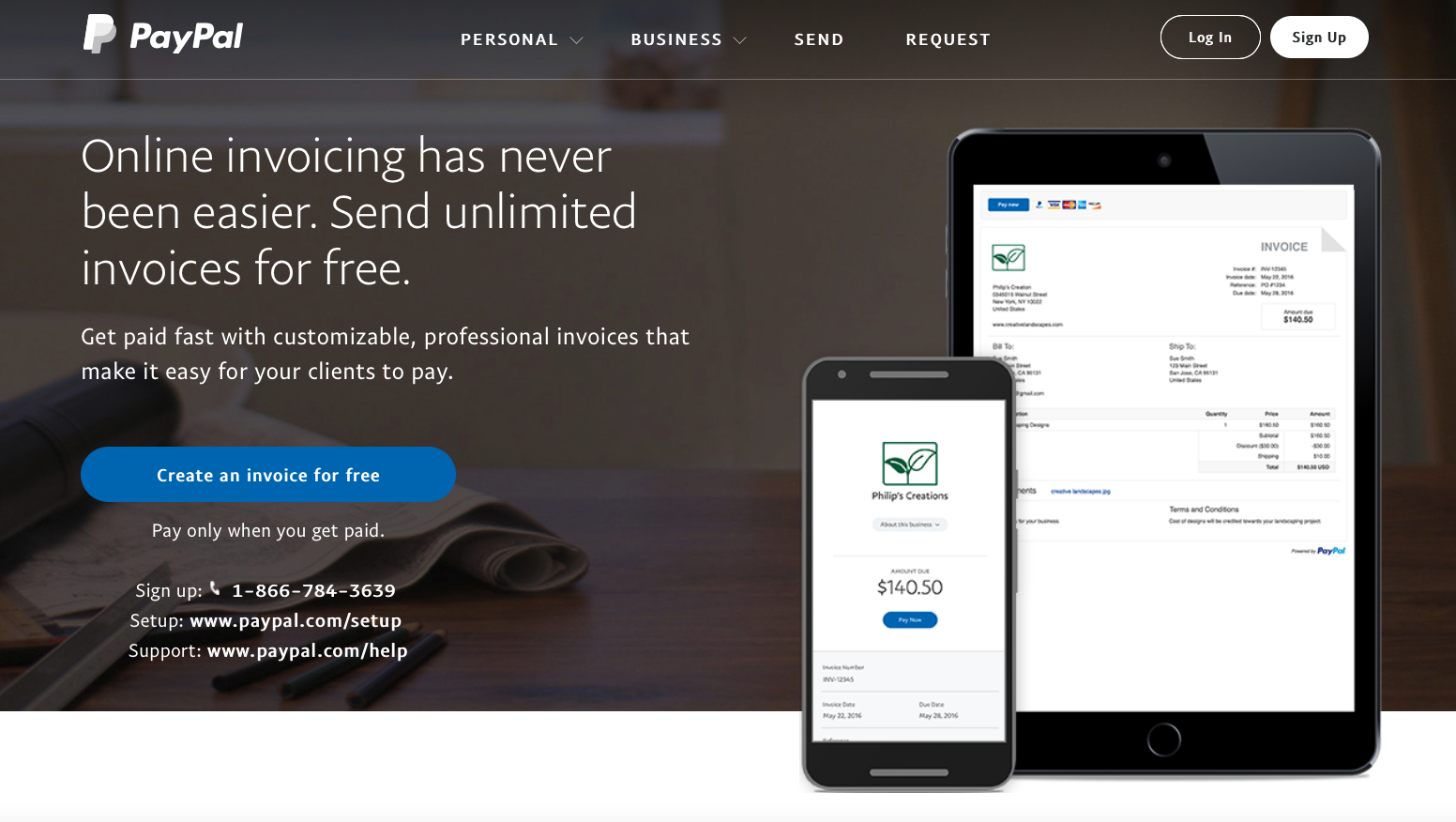
The photo is not only relevant, but it shows the product that’s offered in the ad in action.
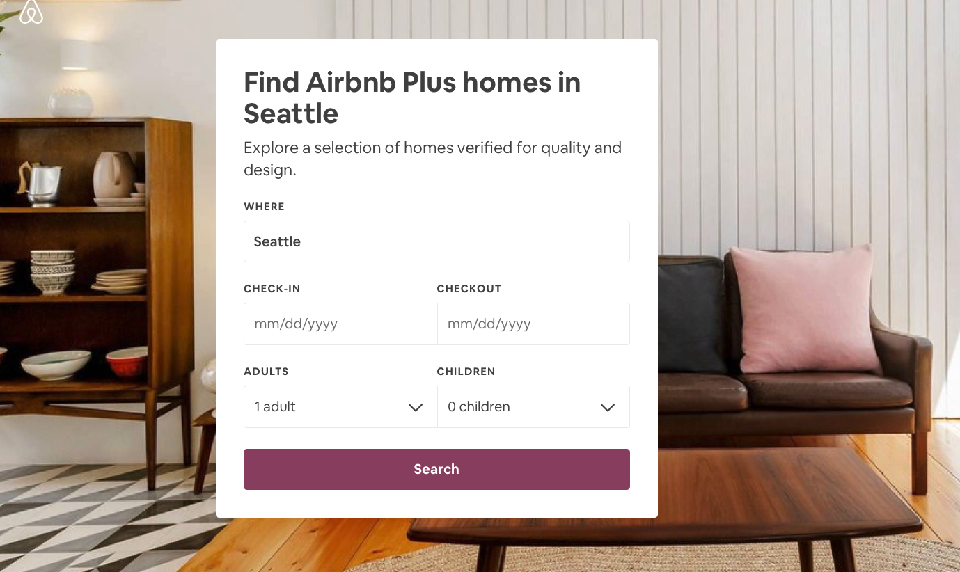
However, that doesn’t mean that a beautiful photo won’t work as well. If you look at Airbnb Seattle, the photo is of a comfortable home that anyone would be happy to stay in. It’s relevant to the service they offer, but it doesn’t detract from the overall purpose of the landing page: to get you to book a stay in Seattle.
Dive Deeper: Overlooked SEO: Optimizing Images and Video For Search
Methods of Contact
When it comes to adding methods of contact on your landing page, simplicity does the trick: the contact form itself, email (which the contact form most often leads to), text or telephone number.
Yes, you can optimize your landing pages for the type of contact you want the lead to initiate, including a good old-fashioned phone call. Search Engine Journal provides a great guide for optimizing for phone calls, including these options:
- Click to Call
- Call-Back Widget
- Clear CTA
- Customized for Mobile
- Heatmap tools to determine the best placement
Of course, the method of contact you use will depend on your offer and the action you want the user to take. The best practice is to provide only one method of contact per landing page. Testing will help you determine which contact method yields the greatest results, and is pretty easy to do with the right landing page builder.
Offer a Guarantee
Typically, offering your lead a guarantee regarding what you will provide for them can result in much higher conversion rates. The reasoning is the same of that in “signaling theory,” which is a psychological theory that guarantees are a signal that customers can trust the company making the guarantee. In the customer’s mind, the guarantee is almost seen as a right to something.
This means that like the PayPal example above, prospects will act on the offer to claim their “right” to create invoices for free, and only pay when they get paid. Note that in that example, the word “guarantee” is not in the statement “Pay Only When You Get Paid,” but is an implied guarantee.
This illustrates that while there should be a guarantee attached to your offer, it does not have to be an implicit one with that particular language.
A Powerful Call to Action
A powerful and simple call to action can make all the difference in your conversion rates.
Look at this page from Hootsuite. There are a couple of simple calls to action, but they are very powerful. The first is in the headline and the box at the top right of the page, “Special Offer – Get 60 Days Free.” 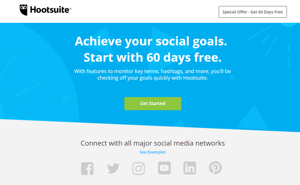
This, combined with the strong headline and the persuasive subhead, motivates leads to click on the green “Get Started” CTA button. It’s very clear that, at least initially, it will not cost the leads anything. Typically, your call to action will also present the user with a sense of urgency. The Hootsuite one above could be improved simply by adding the words “For a limited time.”
How did they know that this call to action, and not another one, would be the most effective? By testing it.
Dive Deeper: How to Create Better-Converting In-Content Calls to Action (CTAs)
A/B Test Your Landing Page
The answer is that you must test your landing pages. It is easy enough to do. In your landing page builder, create several final lines and calls to action, and see which ones perform better. Be sure that your A/B test is testing one element, though – a single outcome you want from potential leads when they click on your ad. If you test more than one element, you won’t be sure which element made the difference in better conversions.
The same can be said for headlines, subheadings, and even the format of your pages. While some of these can be easily eliminated in the development stages and by following the steps in this article, there may be several designs that make it through that process. The best way to determine what works is to test them to determine where you get the best response.

For example, in the Moz landing page we looked at earlier, the logo is hyperlinked. A simple A/B test would include running a page without the hyperlinked logo to see if that change resulted in higher conversion rates.
Or in the example of Square. They might test two different headlines and page formats. They might start with this one, which looks simple enough, and the headline is okay, but a little soft and vague:
Using the same image, they could test this landing page with a different headline and CTA and a subhead:
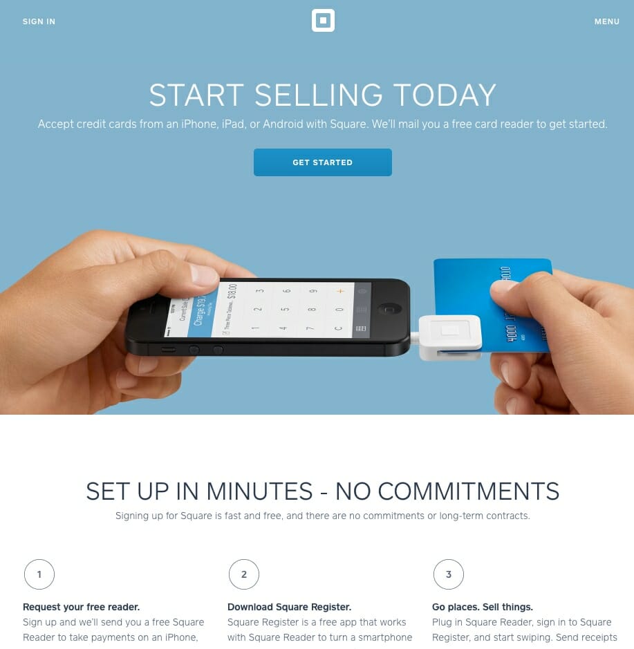
In this case, the headline is much stronger and gives more of a sense of urgency. Running these two landing pages in the same campaign looking for the same result will tell them a lot about what drives conversion.
There are other things that could be tested, too. Changing the color of the call to action button to make it pop, using a different image, and even playing with color choices are all options that inform future campaigns.
It is actually good to have some pages that fail because they inform your future marketing decisions about what not to do and what does not work for your target audience. A/B testing is essentially gathering information so that you can make data-driven decisions going forward rather than just guessing or putting landing pages out there that you like or that feel right to you. Those feelings do not always coincide with results.
The key is not to stop there. A/B testing should be constant, refining your ads until you truly have achieved a landing page design that converts.
Dive Deeper:
- 5 Important Landing Page Elements You Should Be A/B Testing
- How to Run A/B Tests that Actually Increase Conversions
How It Works
How does all this work together? Let’s look at how a well-designed landing page designed to convert works from ad to action.
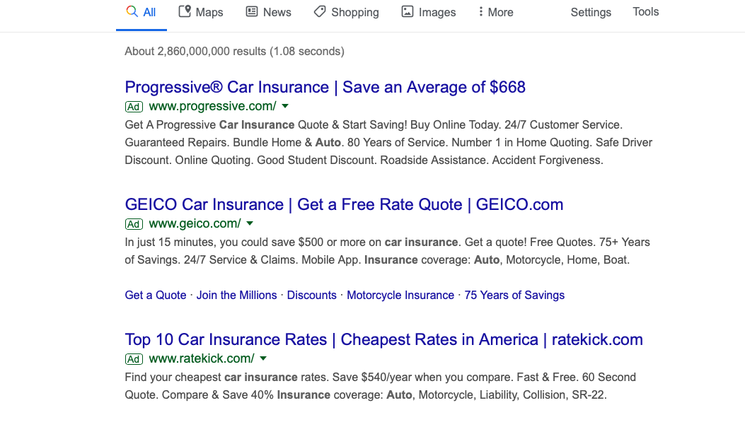
- The lead clicks on your ad – let’s say it’s this GEICO Google ad on the search results page:
- The headline on the landing page fulfills the promise of the ad and identifies who you are. Notice that in this case the headline also serves as a call to action on a very simple but effective landing page.
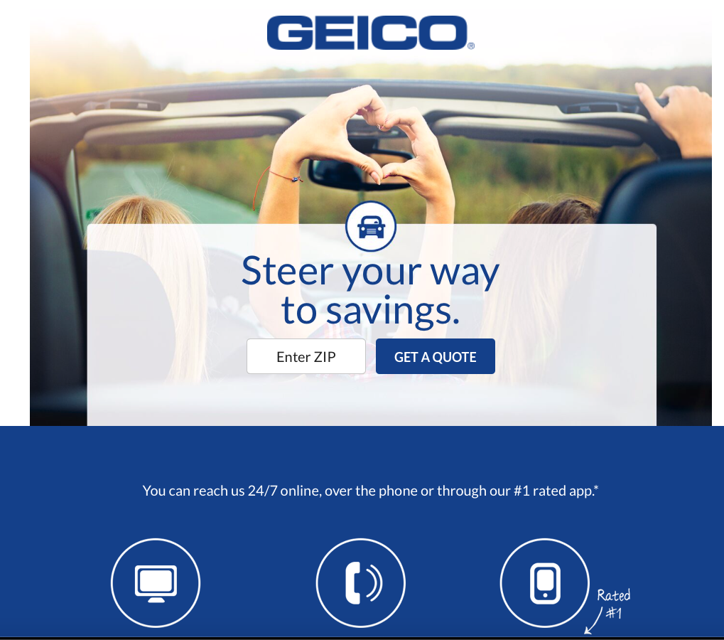
- The subheading expands on the headline and offers another incentive to click.
- Photos are relevant and show the product in action: Happy people driving in a convertible, relaxed and at ease because they know they are protected with good car insurance.
- An optimized form is easy for prospects to fill out and submit. In this case, the user simply enters a zip code.
- The call to action (more on that in a moment), “Get a Quote,” gives them a sense of urgency or is simple to follow.
The process breaks down to those simple steps. But there are a few more elements we need to quickly cover.
Conclusion
Landing pages have a single goal: to fulfill the promise of your ad to your user and get them to convert to a lead or a sale. That’s it.
This is why your landing page builder must fit your needs. It is why you must remove navigation links from those pages and start with a spectacular headline and persuasive subheading. Everything else, from social proof to relevant photos to guarantees, support those headings and subheads and bring users to your powerful call to action. The sense of urgency you have created compels them to click on your offer.
Finally, you must A/B test your landing pages to see which design, which format, which headline and which call to action will give you the best results from your campaign.
