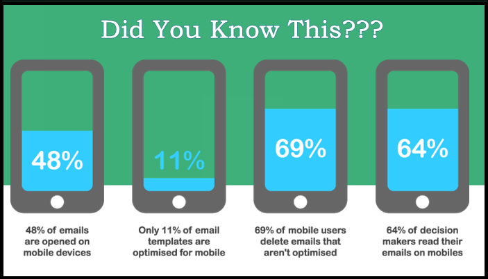
People prefer reading email on their mobile devices.
- The average revenue per mobile email comes to $0.40. This is up to 4x greater than that of a desktop e-mail click.
- Around 34% of email subscribers use only mobile devices to read emails.
- Out of 900 million active Gmail users, a whopping 75% are on mobile.
These stats are astonishing and if you are still relying on an old-style desktop email marketing strategy, you seriously need to rethink it!
(Source)
That said, here are 14 ways to kickstart your mobile email marketing campaign:
1) Optimize Your Subject Lines for Mobile
Subject lines are the first thing that a recipient notices, so it should be bang-on target!
(Source)
Here’s how:
- Keep the subject lines at 35 characters or less.
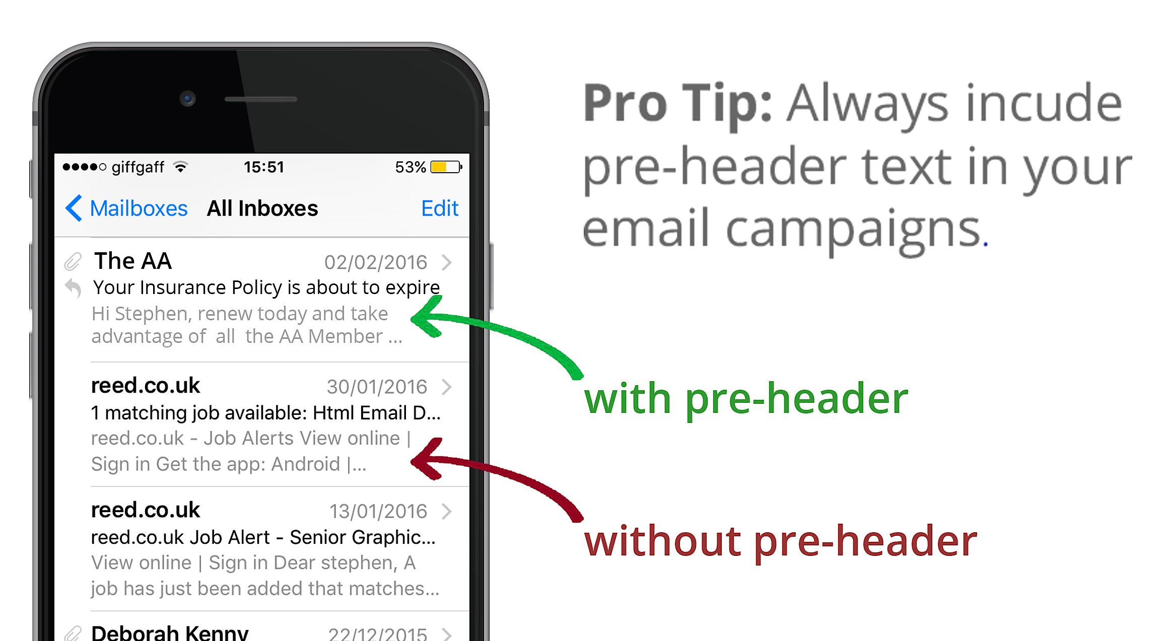
- Leverage pre-header text and make it catchy so that it reinforces the main subject message.
- Follow the KISS approach and Keep It (the message) Simple, Stupid!
- Use the 2-2-2 principle:
- 2 seconds is all you have to get the attention of your customer
- the first 2 words in the message subject line will decide whether the customer will read your message or not
- and the last 2 stands for “today” which creates a sense of urgency and helps the customer take action immediately
- To spark the curiosity factor, you can ask the potential customer a question. This also helps raise CTRs.
- Make use of merge tags to personalize the subject lines with the reader’s name and location.
- Add seasonal slogans and leverage the power of festivity.
Here are some examples of optimized subject lines and pre-headers:
Subject line: Flat 50% Off
Pre-header: Free Shipping – No Minimum
Subject line: Exclusively for you
Pre-header: Love partying? Choose from 50+ offers near you
Related Content:
11 Companies that Are Doing Mobile Advertising Right
Email Marketing Myths & Truths: How to Enhance Your Email Marketing Strategy
How to Collect and Use Emails Without Breaking Amazon’s Terms of Service
2) Create Short Yet Compelling Email Copy
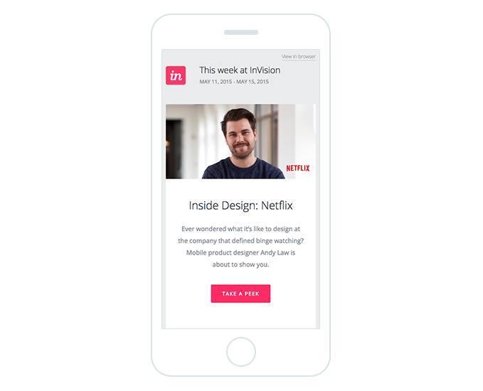
In order to write email copy that converts, you need to find out the “motivational factor” that will persuade the reader to take an action. You need to assume that you are the customer and start thinking from their point of view:
- Who is sending me the message?
- Why are they sending me this message?
- Do I really need their services or products?
- When do I need it?
- Can I trust them?
(Source)
Here are some great tips to get started:
- Always match the subject line with your email copy (click-bait may work once, but only once).
- Make a promise and don’t break it!
- Be sure to sound genuine and trustworthy, so do not overly promote your products or services.
- Be consistent in your messaging (from message to message, but also as a brand).
- Match your target landing page cohesively.
- Make use of powerful action words like “get,” “act,” “grab,” “join,” “build,” “care,” “cause,” “celebrate,” “activate,” etc. so that it motivates the customers to click on your CTA.
- Keep the main points bulleted.
- Bold the important words and underline or italicize the action words.
- Make the email body easy to scan.
Learn More: How To Write Blog Posts that Actually Convert Readers into Customers
3) Use Mobile-Ready Templates
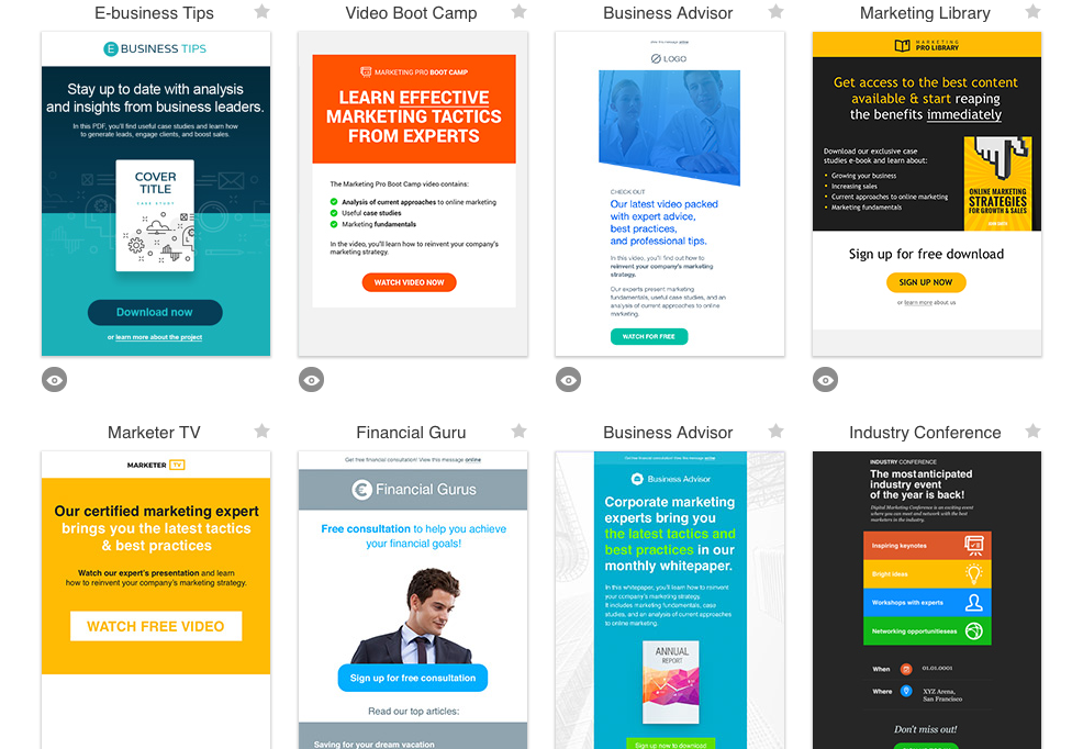
Popular email marketing services like GetResponse offers mobile-ready newsletter templates that you can customize in a few minutes.
- Using ready-made templates is easy and saves you time.
- You don’t need to pay a designer every time you need to change your template.
- You have the options to choose from a variety of templates that relates to your industry.
- It is important to give your emails a new look and mobile-ready templates are a great way to innovate your design.
- Create professional emails that encourage engagement.
(Source)
Learn More: Cold Email Templates that Get Responses
4) Keep CTA Buttons to About 44×44 Pixels
The CTA button is undoubtedly the most important element of your entire email marketing campaign.
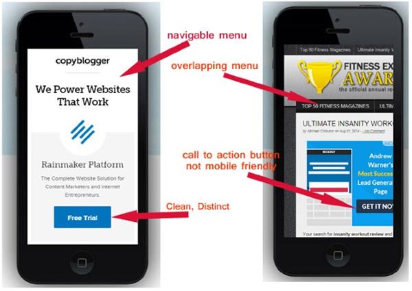
- Your CTA should be visually striking with the main email copy.
- A CTA button that is about the size of an average human finger works best for mobile email marketing campaigns, hence the optimal size should be 44×44 pixels.
- The CTA should be located easily within the main content.
- Buttons initiate clicks and conversions so have a CTA with powerful text and logical placement in order to get conversions.
(Source)
Read More: How To Create CTAs that Actually Cause Action
5) Match the “From” Name with Your Audience’s Expectations
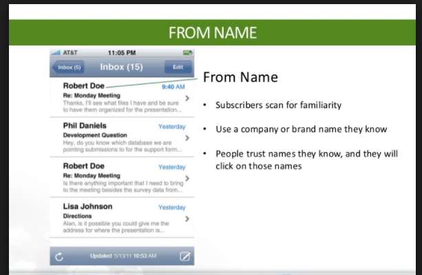
Your audience should be aware of the brand who is sending them the emails, so you need to make sure that the “From” name is a trustworthy one and properly highlighted.
As IBM Marketing Cloud points out, the sender name has become more important because: “People aren’t less interested in email, they’re simply spending less time on irrelevant email.”
With so much email rapidly filling up people’s email inboxes on a daily basis, users are more likely to scan first the “From” line and then the subject line. And that’s it. With mobile devices cutting off the subject line after about 10 characters, the “From” name becomes even more relevant. Additionally, junk mail filters have become less forgiving and users can easily relegate any email sender who is not in their contacts to the spam folder.
Create a customer persona that identifies your audience’s needs.
(Source)
Here are some optimization tips for the “From” name:
- Use the brand name and/or personal name that subscribers would be sure to recognize. If you’re Mark Zuckerberg, use your name. If you’re John Doe, use your brand name.
- Use different “From” names for different newsletter subscriptions, but be sure they are still consistent within your brand. For instance, Delta Air Lines uses “Delta Air Lines” for promotional and frequent flyer emails, whereas they use “Delta Messenger” for flight-related messages (like check-in reminders).
- Test different “From” names if you’re yet sure which is the most effective name.
Related Content: The Complete Guide to Developing and Using Buyer Personas
6) Optimize Images for Better Readability
(Source)
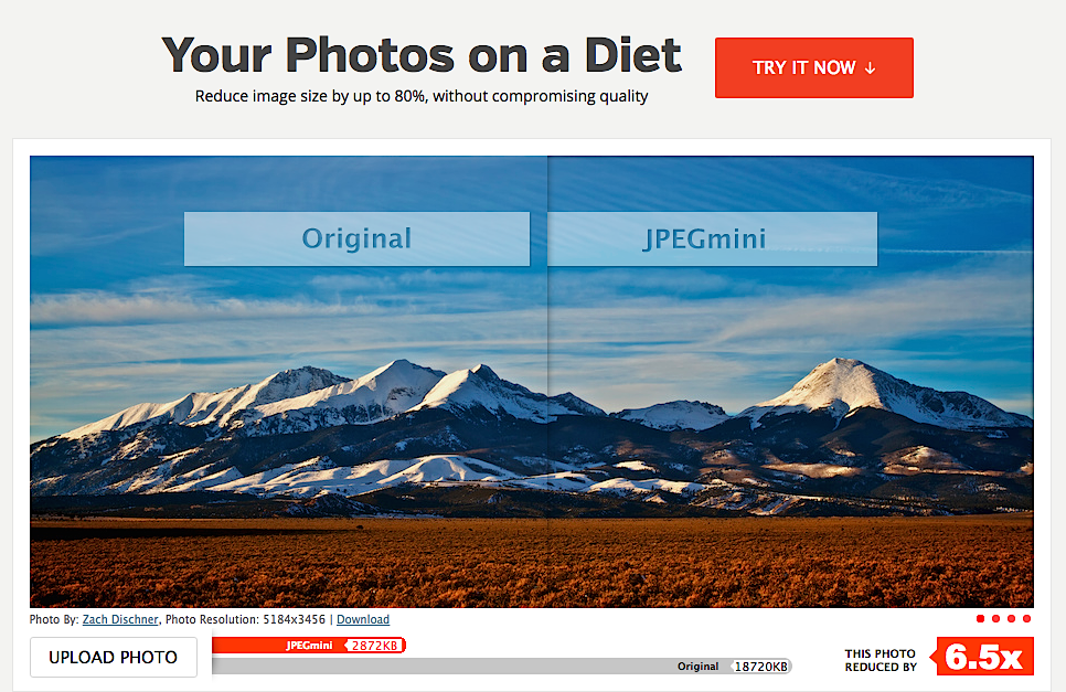
An image is a critical component of a successful email marketing campaign, and especially important for mobile devices. By ensuring that you have properly optimized images, you’ll maintain fast page load speeds which enhances user experience and SEO, plus you’ll keep your storage space and bandwidth costs down.
Here are some tips to optimize your images:
- Reduce the file size of your images without reducing the quality. Use a service like JPEGmini (pictured above).
- Adjust the width of the image automatically as per the screen size. The below code just does that:
- <img style=”max-width: XX%; max-height: auto;” class=”alignCenter shadow” src=”YOUR IMAGE SOURCE.JPG”/>
- Your image should support the main email text.
- Don’t forget to add alt text.
Related Content: 9 Proven E-mail Templates to Add to Your Conversion Funnel
7) Leave Room For Clicking
Adding more space to your email body is essential for better scanning of your message.
- Use a single column layout as it is the most flexible layout for all clients and devices.
- It is recommended to add padding around the message of about 15% for easier readability.
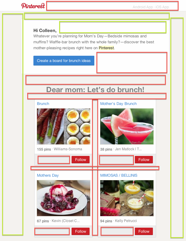
- Any white space that you place intentionally within the content is known as the “active white space” (see the red highlighted space in the below image). This is important because it emphasizes the headline, images and other elements. Similarly, “passive white space” refers to the space that is added automatically in between the sections inside your main content (see the green highlighted space in the below image).
(Source)
Related Content: Cold Emailing: Best Outbound Sales Automation Tools
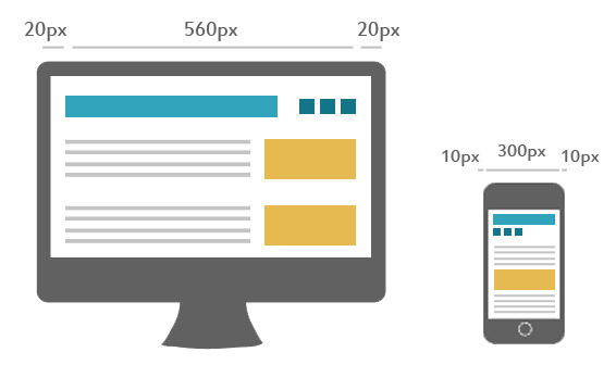
8) Use Media Queries to Adjust Email Width Based on the Device
Media query is a simple way to adapt your email viewability as per the screen size of the user.
(Source)
As defined by w3schools: “Media query is a CSS technique introduced in CSS3. It uses the @media rule to include a block of CSS properties only if a certain condition is true.” It allows content to adapt to screen resolution and is imperative for responsive web design.

(Source)
It is recommended that the email’s normal CSS is inlined and the media query CSS overrides the styles once it’s triggered.
You need to use the max-device-width feature that looks at the size of the device’s screen and adjusts the width automatically.
Read More: The Ultimate Guide to Mobile Advertising
9) Use a Combination of High Contrasting Colors
When you create emails, do you check them for color contrast?
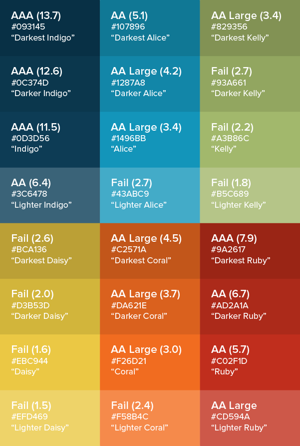
Color contrast ensures better readability and lets you reach your potential audience. Here are some tips for better color contrasting:
- Use a color contrast analyzer to find the perfect color combination that works best for both foreground and background colors.
- When examining the body text contrast, aim for the lightest gray with a AAA.
- For links and buttons, go for AA.
- Have some extra color combinations for driving some more attention from the users when required.
(Source)
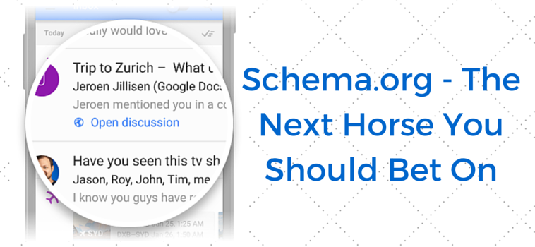
10) Integrate Schema.org Markup in Your Gmail Emails
You can use either JSON-LD or Microdata in order to embed schema in your emails. As Kissmetrics puts it: “Schema markup is code (semantic vocabulary) that you put on your website to help the search engines return more informative results for users. If you’ve ever used rich snippets, you’ll understand exactly what schema markup is all about.”
Using schema in emails will help you to:
- Highlight important information in the inbox.
- Add actions to the email subject lines.
- Emails having proper markup appears in the SERPs, so if your target customer is using Google on a mobile device then your email has a fair chance of getting displayed as per the relevancy of the search query.
(Source)
To learn more about how you can use semantic emails using Schema markup, head over to this article: Semantic Email Marketing Using Schema Markup.
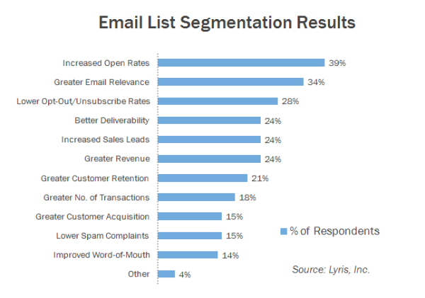
11) Segment Your Marketing Campaigns
I am a big fan of segmentation when it comes to any form of marketing. Why? Because obviously a teenager is not interested in buying diapers! Hence, you must create campaigns that specifically aim to solve a problem of your intended audience.
- Segment your email campaigns on the basis of location, demographic, occupation, personality, behavior as per the mobile device used, volume, product space, etc.
- Identify the reason why your target audience is using a mobile device. Are they using it for research or to buy something? Make use of Google Micro Moments to determine the mobile user’s purpose and then segment them accordingly.
- Engagement often follows segmentation so stick with your problem-solving approach and you are sure to get results.
(Source)
Check out Kissmetrics’ post 10 Quick and Easy Email Marketing Segmentation Strategies to Try Today for more ideas.
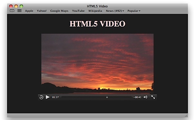
12) Use HTML5 For Videos
As per Campaign Monitor, video in emails have been know to:
- Boost open rates by 19%
- Boost click-through rates by 65%
- Reduce unsubscribes by 26%
It is now possible to use video in emails, thanks to HTML5.
(Source)
Here is a sample code that will let you play video within an email (courtesy of Email On Acid):
<!– video section initially hidden –>
<div class=”video-wrapper” style=”display:none;”>
<p>Video Content: MP4</p>
<video width=”320″ height=”176″ controls poster=”http://www.emailonacid.com/images/blog_images/Emailology/2013/html5_video/bunny_cover.jpg”>
<source src=”http://www.w3schools.com/html/mov_bbb.mp4″ type=”video/mp4″>
<!– fallback 1 –>
<a href=”http://www.emailonacid.com” ><img height=”176″
src=”http://www.emailonacid.com/images/blog_images/Emailology/2013/html5_video/bunny_backup.jpg” width=”320″ /></a>
</video>
</div>
<!– fallback section initially displayed –>
<div class=”video-fallback”>
<p>Fallback Content</p>
<a href=”http://www.emailonacid.com” ><img height=”176″
src=”http://www.emailonacid.com/images/blog_images/Emailology/2013/html5_video/bunny_backup.jpg” width=”320″ /></a>
</div>
The above code will display videos when the client email provider supports them and will display an image in case the video fails to play. This is referred to as video fallback content.
Related Content: The Ultimate Guide to Video Marketing
13) Check the Message Quality Score (MQS)
You certainly don’t want your email to get blocked by spam filters!

(Source)
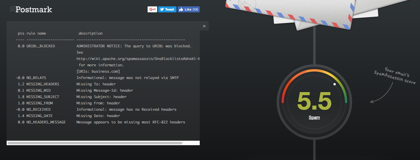
Since 99.99% of email accounts use spam filters, it’s critical that you use a tool that helps you analyze whether your email will wind up in your recipients’ junk folder. If it doesn’t bounce back, you will assume that the recipient received it, and will wind up with a false positive.
Email marketers should be sure that their email messages do not contain any words or phrases that trigger spam filters. It is recommended that you check the message quality score, or MQS, and improve the spam score before sending it to your mobile audience. Tools like Postmark, Sender Score, Mail Tester and isnotspam are of great help.
(Source)
Related Content: 10 Best Mobile Advertising Tools to Help You Promote Your Business
14) Test Your Email Before Sending It
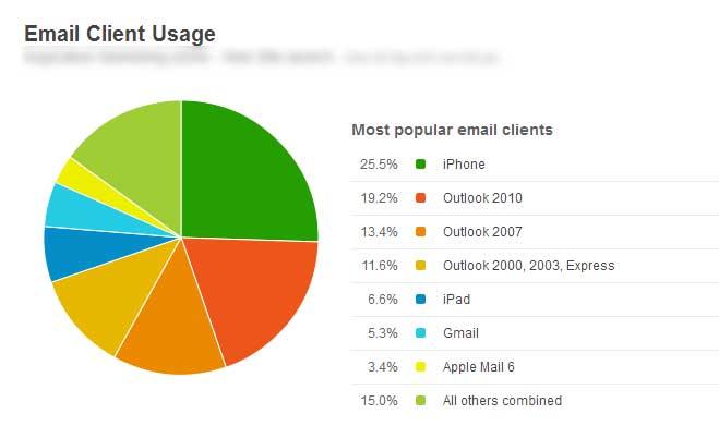
You don’t want to lose your customers by sending them an unprofessional email. Therefore, it is always recommended that you test your emails before sending them. The below table lists the email client usage of popular providers that you must test to ensure uniformity of your mail message:
(Source)
Here are some tools that are of great help:
- GetResponse – View your email on all selected email platforms at once. Don’t let a small error in code spoil your entire email campaign. GetResponse lets you check your email across iPhone, iPads and Android devices to ensure that your emails look perfect for all subscribers.
- Litmus – Lets you see screenshots of your email across 70+ devices to make sure that your message reaches your audience without any hindrance.
- Email on Acid – Test your email for broken links and code errors and view your results in aggregate and individually.
In order to drive results for your business, it is important to optimize your mobile email marketing strategy.
Related Content: How to Get More Responses From Cold Emails
Do you know any other tricks to drive more ROI, engagement or CTR? Please let me know in the comments below!


