On May 28, 2020, Google announced the Page Experience Update, with a gradual rollout date beginning in mid-June 2021.
Google algorithm updates are something that make webmasters and SEOers worry, especially due to the suddenness and, sometimes, lack of warning or detailed information (like the unnamed update on February 7, 2020 or the mysterious 19-result SERPs update on March 1, 2019).
Thankfully, this time Google has announced this new update well in advance, giving webmasters and marketers enough time to plan for it.
So what is the Page Experience Update and how do you prepare for it? We’ll tell you everything you need to know.
TABLE OF CONTENTS:
What Is the Page Experience Update?
The Google Page Experience Update measures the overall experience that a user has while interacting with a web page (this is different from the informational value offered by the webpage).
According to Google:
The page experience signal measures aspects of how users perceive the experience of interacting with a web page. Optimizing for these factors makes the web more delightful for users across all web browsers and surfaces, and helps sites evolve towards user expectations on mobile. We believe this will contribute to business success on the web as users grow more engaged and can transact with less friction.
This update is to ensure an improved user-friendliness to all websites.
For example, Google measures “dimensions of web usability such as load time, interactivity, and the stability of content as it loads (so you don’t accidentally tap that button when it shifts under your finger – how annoying!)”:
Content remains the most important factor for ranking, but “in cases where there are multiple pages that have similar content, page experience becomes much more important for visibility in Search.”
Therefore, to reap the benefits of your content marketing efforts and obtain a higher ranking in search results, you must optimize your website for the Google Page Experience Update.
The Core Factors of Page Experience Update
The Page Experience algorithm consists of several signals, including Core Web Vitals (loading, interactivity and visual stability), mobile-friendliness, safe browsing, security (HTTPS), and no intrusive interstitial:
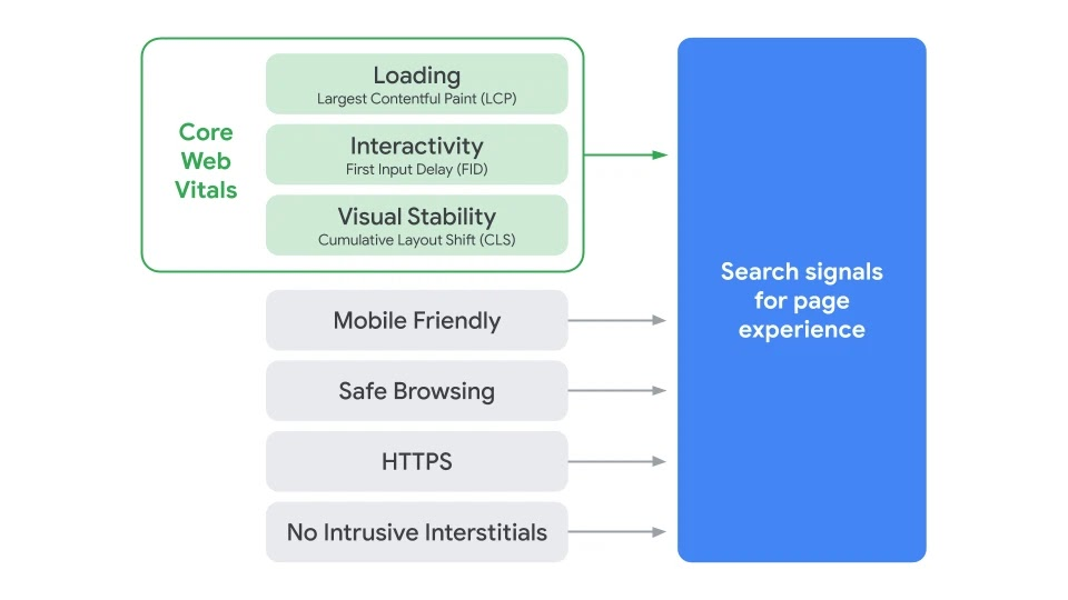
Here is how Google documents each of the signals mentioned above:
- Largest Contentful Paint (LCP): This metric measures the time in which the page’s main content – specifically, the largest content element – loads. You should aim to have an LCP of under 2.5 seconds:

- First Input Delay (FID): This metric tracks the time between when a user first interacts with your web page (click a link, tap on a button, etc.) to when the page actually responds. As Google puts it, “It’s like measuring the time from ringing someone’s doorbell to them answering the door.” To provide a good user experience, strive for an FID of less than 100 milliseconds.
- Cumulative Layout Shift (CLS): This tracks the visual stability of the content on your web page. If your site layout shifts unexpectedly, it is considered a bad user experience. If you’ve ever tried to click or tap on something and the button or link shifted, you know how frustrating this can be. Ensure that your CLS score is less than 0.1:

- Mobile-friendliness: This signal checks if your page is responsive. Mobile users account for more than 51% of overall Internet traffic, and Google wants to give them the best possible user experience.
- Safe browsing: This checks if your site contains any malware or deceptive (e.g., social engineering) content.
- HTTPS: This analyzes whether your site’s connection is secure via HTTPS or the non-secure HTTP.
- Intrusive interstitials: This ensures that the main content is easily accessible to the user. An interstitial is an ad that appears when a web page is downloading.
Related Content:
* What Is the Google BERT Search Algorithm Update?
* Navigating the Aftermath of Google Core Update November 2023
* 4 Ways to Signal to Google that You’re an Expert Content Creator
7 Steps to Optimize Your Website for the New Page Experience Update
Now that you know what Google’s new Page Experience Update is and its core components, let’s walk through how to prepare your site for it.
1) Make Your Website Mobile-Friendly
A part of the Page Experience Update, mobile-friendliness has a major impact on your website’s ranking. Google said it would switch to mobile-first indexing for all sites starting September 2020.
Use Google’s Mobile-Friendly Test to determine whether your website is responsive. It also shows all the page loading issues on your website:
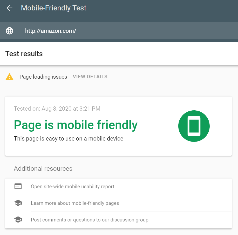
Click on view details beside page loading issues to check whether any pages can’t be loaded:
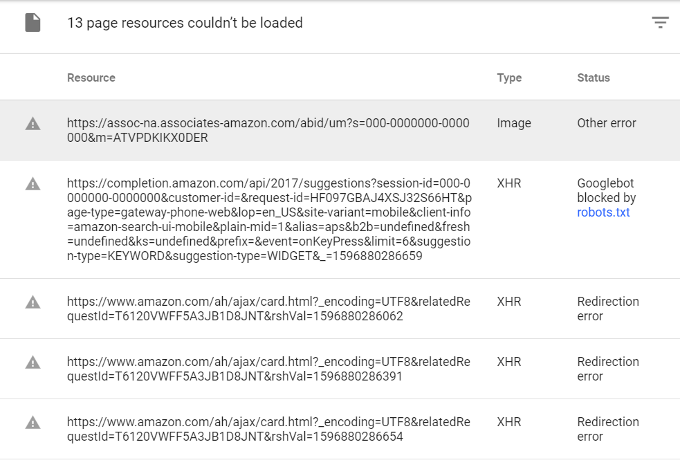
Fix all page loading issues as suggested by the tool.
If your website is not responsive, then it has a higher chance of being negatively affected by the Page Experience Update.
If you are running your site on an outdated theme or using a site builder that isn’t optimized for mobile, you should consider migrating your website to a mobile-friendly web builder.
For example, Squarespace does not offer an option to upload images in the WebP format. It still uses older formats like .jpg, .gif and .png, which are slow to load.
If you are running an informative website like a blog, then WordPress is the best option for you. It is a highly rated web design software and offers responsive design with a range of plug-ins to improve the user experience.
Moreover, it has a large community of developers with whom you can discuss any issue and get help. You can fix everything you need to make your site optimized for the Page Experience Update. For example, plug-ins like WPtouch Pro can make your website mobile-friendly, while plug-ins like WebP Converter for Media can automatically convert all the images on your site to WebP.
If you are running an e-commerce store, then it is better if you migrate your website to a mobile-friendly e-commerce solution like Shopify or BigCommerce that offer support for WebP.
Apart from making your website responsive, there are certain things that you should focus on to improve the page experience of your mobile site. Google has highlighted these points in their “what makes a good mobile site” page, which includes:
- Keep menus short and organized. Merge fields that are similar into one in order to reduce the number of links in the menu bar.
- Ensure that your logo on your mobile site takes users to your home page.
- Make it easy for mobile visitors to access the search box. Don’t hide it in the menu bar.
- Ensure that your text and images are responsive. All the content on your page must be readable on devices of all sizes.
- Avoid CTA buttons that launch new windows in mobile devices.
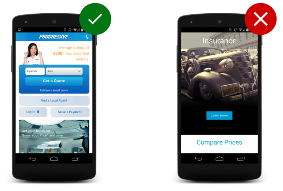
- Keep CTA buttons above the fold and in the center. Avoid using vague call-to-action buttons like “learn more”:
I would recommend that you use WordPress as your web design platform because it offers responsive design and a variety of useful plug-ins.
Dive Deeper:
* Mobile-First Indexing: What You Need to Improve Your Site’s Ranking
* Top 10 Mobile Optimization Best Practices For E-commerce Sites
* 12 Quick Fixes to Make Your Mobile Traffic Convert
2) Improve Your Site Speed
Loading time is one of the elements of the Core Web Vitals. The quicker a page loads, the better the user experience. And it’s not just Google that hates websites that take too much time to load – it’s users, too (or, rather, especially users).
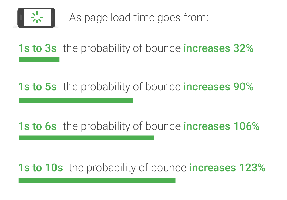
According to Google, when the load time of a site goes from one second to three seconds, the probability of the user bouncing increases by 32%. When it further increases to six seconds, the your bounce rate can increase by 106%:
The first step to increase your site speed is by checking how long your website takes to completely load. You can do that by entering your domain URL in Google’s PageSpeed Insights.
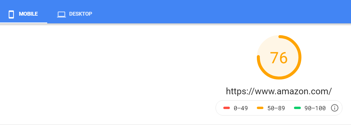
The PageSpeed Insights tool gives your website a score from 0-100 (where 0-49 = poor, 50-89 = improvement, and 90-100 = good).
For example, Amazon has a score of 76, which indicates that it needs improvement:
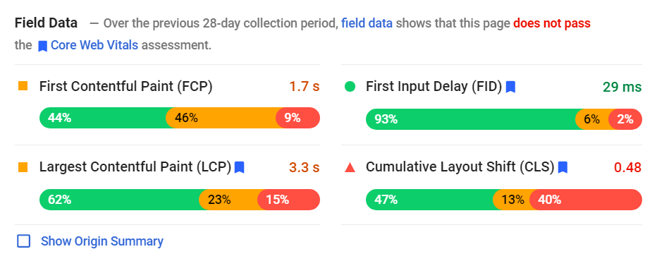
PageSpeed Insights also helps you check whether your website passes the Core Web Vitals assessment test. In addition, it displays a set of opportunities to improve your site loading speed. Make sure your page passes this test for an improved page experience.
As you can see in the image below, Amazon does not pass the Core Web Vitals assessment because its LCP is more than 2.5 seconds, and the CLS is more than 0.1:
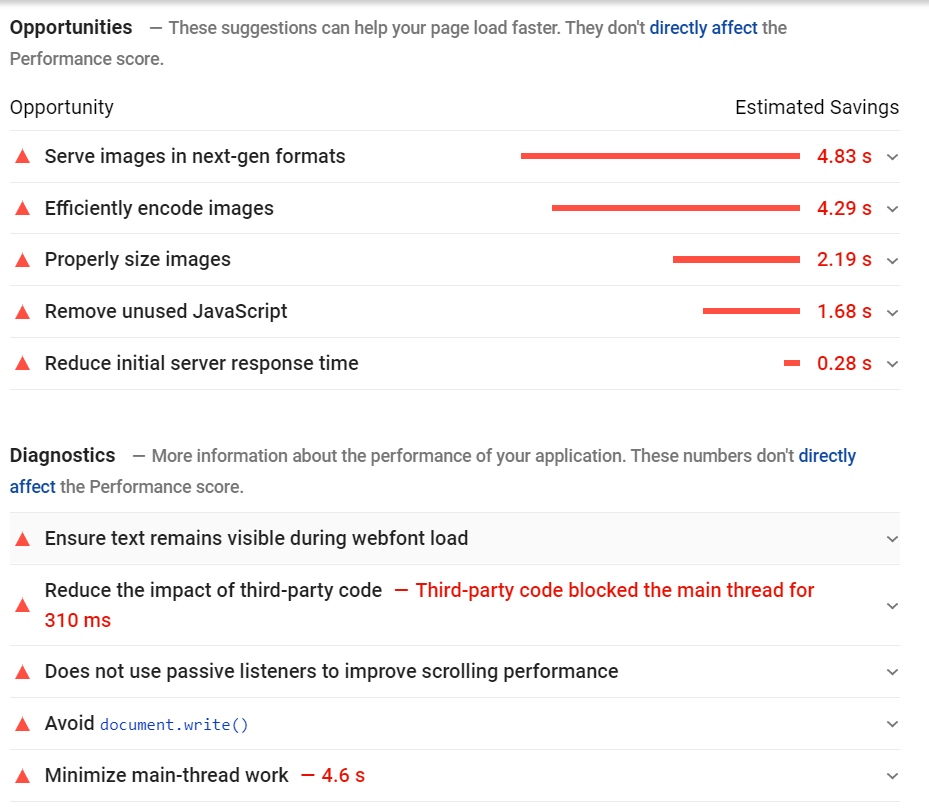
As you scroll down, you will see the recommendations to improve your site speed. It also displays the estimated savings for each suggestion:
Once you complete the tasks suggested by PageSpeed Insights, follow these steps:
- Compress all the images on your website. Use the new WebP format to employ both lossy and lossless compression:
- Lossy WebP compression uses predictive coding to encode an image. Predictive coding uses the values in neighboring blocks of pixels to predict the values in a block, and then encodes only the difference.
- Lossless WebP compression uses already seen image fragments in order to exactly reconstruct new pixels. It can also use a local palette if no interesting match is found.
- Use a CDN (content distribution network). A CDN saves various copies of your website on multiple locations across the globe and then delivers the nearest version to the user, thereby decreasing the loading time.
- Create AMPs (accelerated mobile pages) of your website. AMPs are a lightweight version of your website that loads quickly on mobile devices.
- Eliminate unnecessary HTML, CSS and JavaScript codes. Also, combine multiple CSS and JavaScript files into one.
- Use asynchronous loading for CSS and JavaScript files to load them simultaneously.
- Enable browser caching to increase the load time for returning visitors.
3) Boost Your Site Security
Google wants webmasters to offer the best possible experience to its users and that includes safeguarding their online information. Poor website security has a negative impact on your SEO rankings.
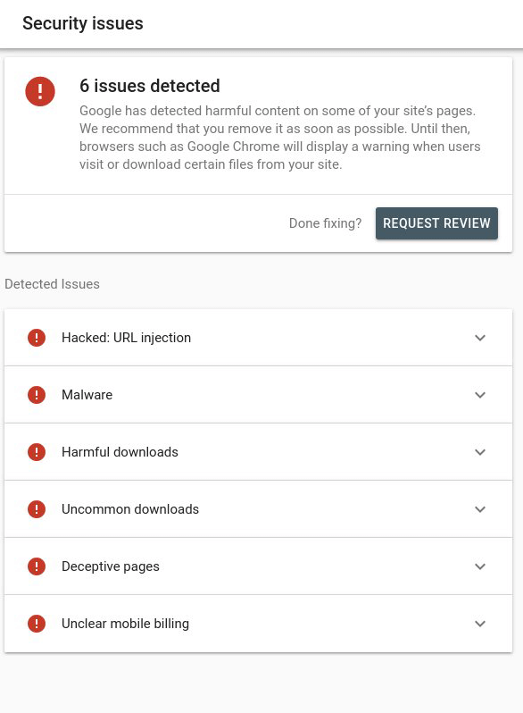
Make sure your website is not hacked by cybercriminals. Check your Google Search Console to determine if your site has any security issues. You can find that info on the left-side navigation under “Security and Manual Actions”. As soon as you fix the problems, click on “Request Review” to inform Google that you have improved your site’s security:
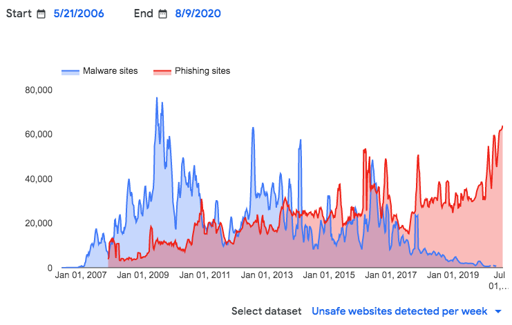
I also recommend using Google Transparency Report to understand how Google identifies unsafe websites. This helps you to better strengthen your site security:
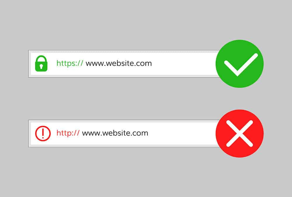
Additionally, implement an SSL certificate on your site. SSL stands for Secure Sockets Layer and this digital certificate provides authentication of an encrypted connection for a website. In other words, it makes your website HTTPS. Sites without HTTPS are at risk of getting affected by the Page Experience Update:
Choose the right type of SSL certificate depending on the kind of customer data you collect. For example, if you handle only the name and email addresses of visitors, an SSL certificate from Let’s Encrypt is suitable. However, if you accept online payments, choose a premium SSL certificate like Comodo.
Dive Deeper:
* How Poor Website Security Negatively Impacts SEO Rankings
* How to Keep Your E-commerce Site Secure Against Cyber Threats in 2023
* 6 Tips for Securing Your Data from Cyber Attacks as a Remote Worker
4) Focus on Content
As mentioned above, content still plays a crucial role in your page’s ranking. No matter how great a page experience you offer, all your efforts will be in vain if the content is not good.
With over 74% of marketers using content marketing to promote their business, it is essential to produce high-quality posts.
Here are some tips to enhance your content quality:
- People: Write for your audience (i.e. human beings) and not search engines. Ensure that your content addresses the pain points of your buyers. Also, create content for each stage of the sales funnel to attract and nurture the right customers.
- Examples: Use examples to clarify points that you write. It helps users better understand the content, especially when you’re discussing complicated or otherwise hard to visualize info.
- Skyscraper Technique: Check out the best-performing content of your competitors and then use the skyscraper technique (coined by Brian Dean) to write your own – but vastly improved (do not plagiarize!) – version.
- Headline: Most people won’t make it past the headline, so write a compelling title to attract as many visitors as possible. Also, craft a persuasive introduction to the article to make them read the whole content. A good intro is a lot like an ad: short, informative and to the point.
- Headers: Use relevant subheadings throughout to help users scan and better understand your article. If you have a lot of headers, create a clickable table of contents at the top of the page.
- Mistake-Free: Ensure there are no grammatical and spelling errors. Get an editor to proofread it or use a tool like Grammarly.
- Images: Be sure to include relevant (no random stock photos!) images, graphs and/or videos. Not only do images help the reader to better understand the content, but they break up blocks of text for better UX.
- Data: Be sure to do your research in order to provide a data-driven article. This will signal to Google that you are an expert content creator – someone who embodies E.A.T.:
- Expertise: The page needs to have quality content written by an expert writer with proven experience, knowledge or qualifications.
- Authority: The site itself needs to have some authority on the subject.
- Trustworthiness: The site needs to have other authoritative links pointing to it from similar, trusted websites in their industry.
Related Content:
* How to Write Content for People and Optimize It for Google
* How to Use Google Keyword Planner for Content Creation
* 30 Ways to Come Up with Great Ideas for Your Blog Posts
* 9 Tips to Take Your Blog Content from Average to Awesome
5) Use Heatmaps to Find USAbility Issues
Heatmaps help you understand what your site visitors do on your web pages, where on the page they are navigating to, and where they are getting stuck. These insights can help you improve your web design, thereby enabling you to enhance the overall page experience.
Use tools like Crazy Egg or Hotjar to understand what users are experiencing when engaging with your website.
Here’s an example to better understand how heatmaps help find usability issues. As you can see in the below image, the areas highlighted are where most people are clicking on the page (the more red, the more the clicks):
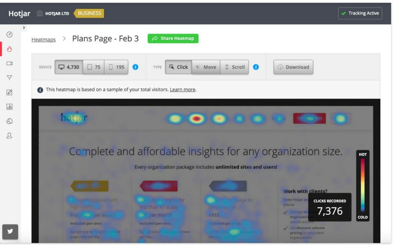
Ensure that all the places that users click takes them to a relevant resource (or page), because if a lot of them are clicking on those areas, it means they are expecting something specific. If not, visitors are likely to be disappointed, which is something you do not want.
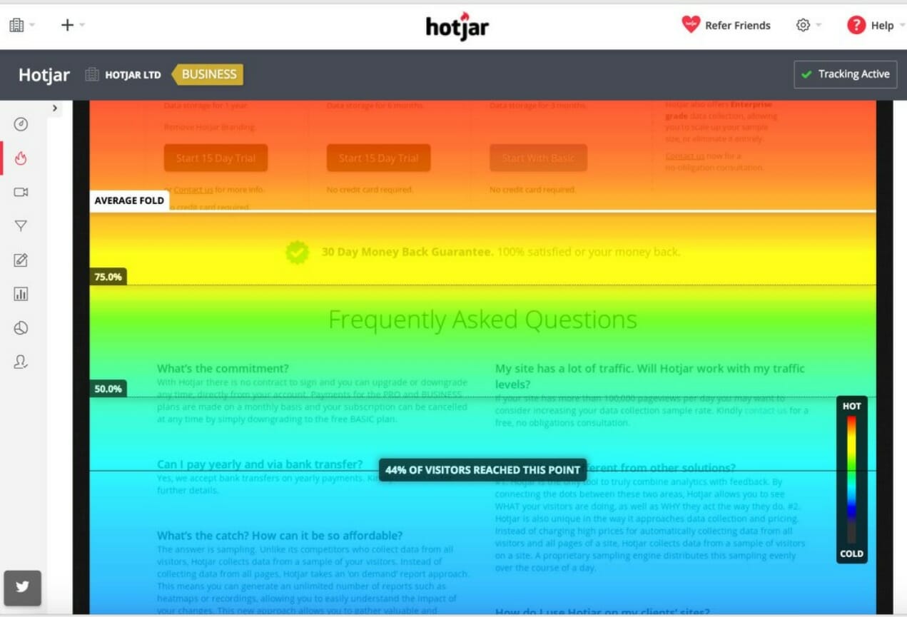
The next step is to check the scroll heatmaps. This shows how deep users are going on your website and allows you to ensure that they are reading the primary information you want them to on your site:
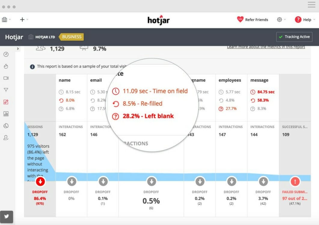
For forms, you can check how much time visitors take to fill out the fields. This also displays where most users are dropping off, helping you improve the overall user experience:
Pro Tip: Check the most popular URLs on your site first.
6) Reduce Bounce Rates
Though the bounce rate is not a core component of the Page Experience Update, this metric indicates that your web page provides value to your visitors.
High bounce rates signal to Google that the page has little value in the context of a searcher’s query.
It can also be a sign of bad user experience. As a result, Google will eventually lower your site ranking for those search queries.
A bounce rate of 26-40% is considered good. If your website has a bounce rate of more than 40%, you need to work on it to make users stick around longer.
Here are some ways to lower the bounce rate and increase dwell time:
- Limit the number of CTAs so as not to confuse and overwhelm visitors (“which one do I click on??”).
- Use videos on your homepage and other important pages to engage your audience.
- Implement exit-intent pop-ups to show targeted messages to users when they are about to leave your website.
- Improve your site navigation to make it easier for users to find the information they are looking for.
- Ensure that your page’s content is easy to understand and appropriately formatted (with headers, visuals and bulleted lists).
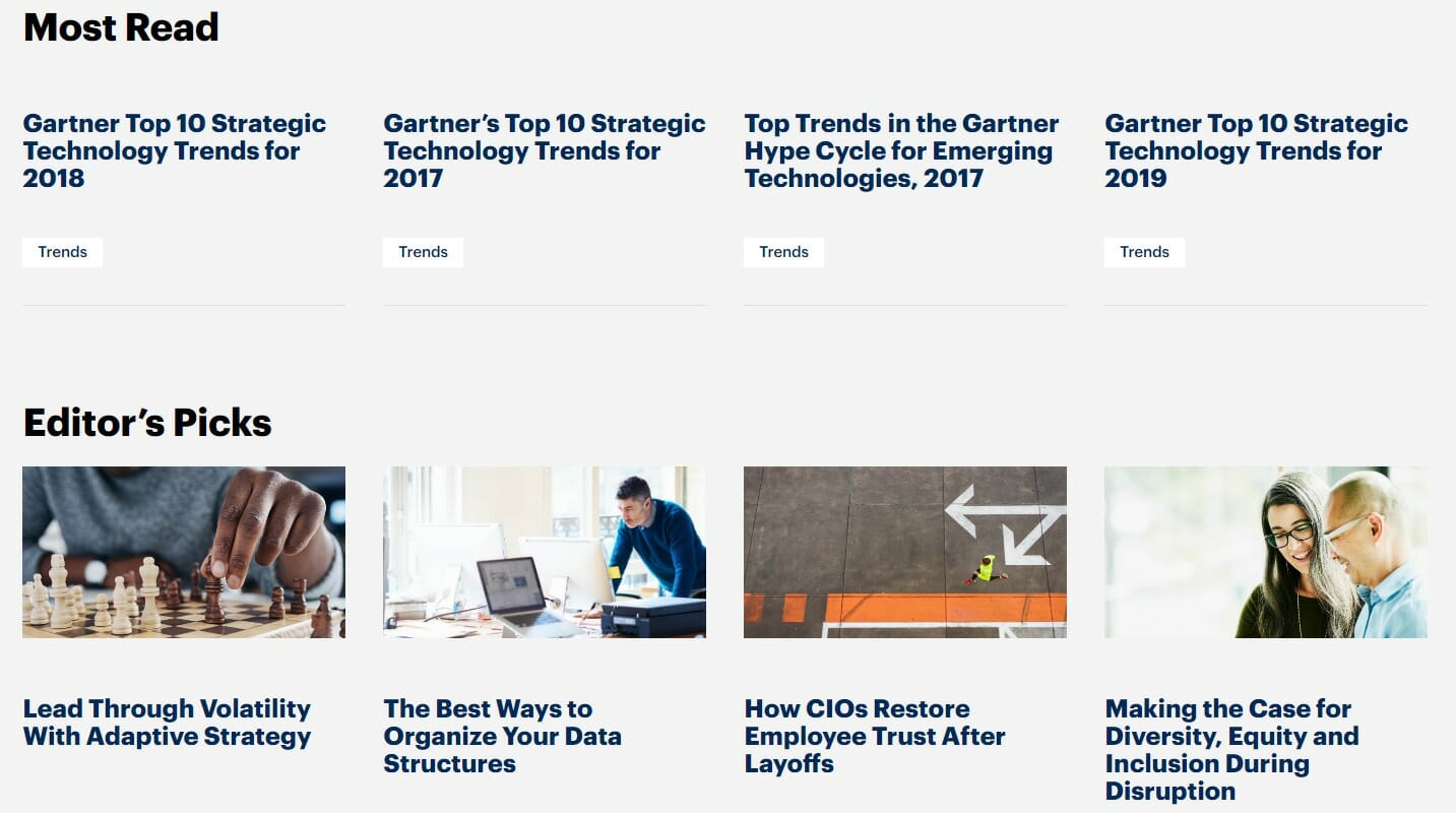
- Add internal links on each page. You can also use plug-ins to add relevant content at the end of the webpage like this:
Dive Deeper:
* How Correctly Used Pop-Ups Can Help Increase Leads
* How to Create CTAs that Actually Cause Action
* 17 Engaging Video Content Types that People Love to Watch
7) Remove Intrusive Interstitials
The primary reason that someone visits your website is that they think you can help them solve their problem or answer their query. Therefore, it is your responsibility to help users easily access the content on your site.
If you visually obscure the content with interstitials, it provides a poor experience to users, which increases your chance of getting negatively impacted by the Page Experience Update.
Here is an example that highlights what you should and should not do:
- Notice the interstitial (i.e. pop-up ad) at the top of the page on the left-hand example. It discreetly says “Tap here to access The Home Depot Android app.”
- The second pop-up (“Download Our App”) blocks the primary content, forcing users to either click on the link or close it. Google does not recommend using interstitials like the second one.
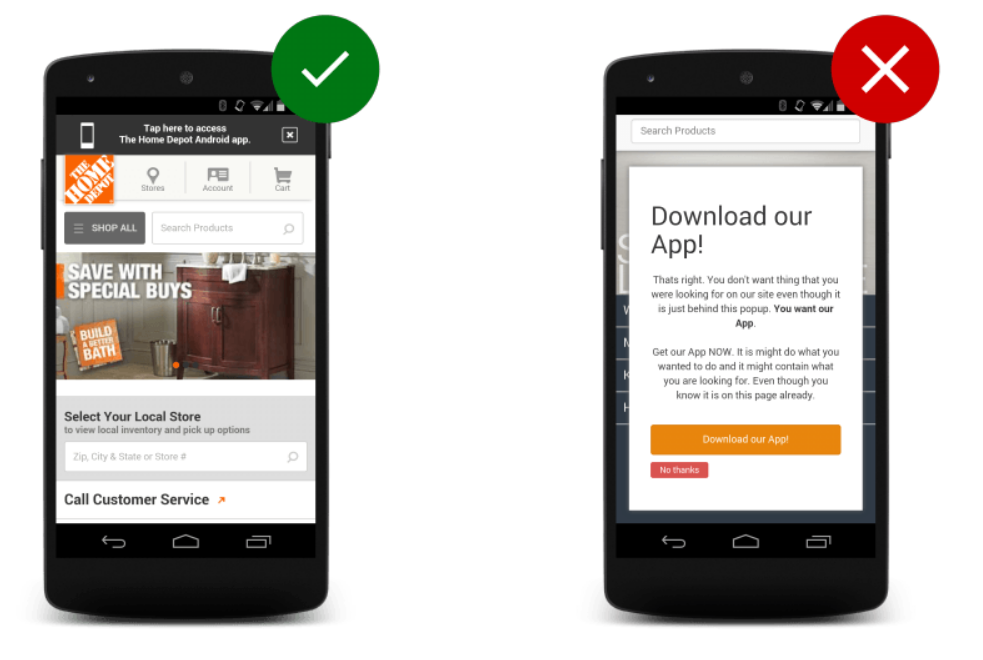
Here are some examples of interstitials that won’t hurt your rankings even after the Page Experience Update. This includes pop-ups that are required by law, such as age verification, or pop-ups that don’t hide the primary content on the page, like a small banner at the top:

Also, remove any ads that appear before the main content fully loads. As soon as a visitor lands on your website, the first thing they should see is the page’s primary content – not your plea for them to sign up or download something before they’ve even read your article.
Wrapping Up Google’s Page Experience Update
Google’s Page Experience Update will be launched in 2023, giving you plenty of time to prepare for it. Follow the 7 steps mentioned above to optimize your website for the this new algorithm update to stay ahead of your competitors and continue providing value for your site visitors.
If you need help tackling the challenge of online visibility and increasing your organic traffic, Single Grain’s SEO experts can help!👇


